
元服务
提示
这里文档标题 《元服务》 是有歧义的,原本真的打算给元服务专开一个文档页,后来越写越多,发现很多也是普通应用开发的知识,索性就这么一直写下去了。
其实现在已经完全是 普通应用 开发文档了。但是已经有一个 HarmonyOS 文档了,所以名称也就不改了。😂
构建
多模块配置
多目标产物
配置多目标产物-配置构建-编译构建-DevEco Studio
product: 理解为不同的版本,社区版、高级版,如不同的应用label、icon等,需要在工程级的
build-profile.json5 -> app{} -> products[]配置多个product,如Community和Ultimate。target: 理解为不同版本的软件部分功能存在差异,需要在模块级的
build-profile.json5 -> targets[]中配置多个target,如vip和free。关联关系: 工程级
build-profile.json5 -> modules[] -> targets[] -> applyToProducts中配置。"targets": [ { "name": "default", "applyToProducts": [ "default", "Community", "Ultimate" ] }, { "name": "free", "applyToProducts": [ "default", "Community" ] }, { "name": "vip", "applyToProducts": [ "default", "Ultimate" ] } ]由上配置:
- target:
default被应用至 product:default、Ultimate、Community中; - target:
vip被应用至 product:default、Ultimate中; - target:
free被应用至 product:default、Community中。
- target:
证书
FAQ-管理证书、指纹-AppGallery Connect
Generate Key and CSR
打开窗口:DevEco Studio -> Build -> Generate Key and CSR
Generate Key
Key Store file(*.p12)
filename:
enlin_app.p12password:
***/***.
Key
- Alias:
enlin_app
- Alias:
Generate CSR
提示
证书请求文件就是它。
跳转到这一步的时候,只有最后一栏
CSR file(*.csr)是空白的,需要进去创建,输入你想要的文件名点击 Finish 。- CSR file(*.csr)
- filename:
enlin_app.csr
- filename:
- CSR file(*.csr)
共用证书
当您存在多个应用时,可以让多个应用使用同一个证书。以发布证书为例,多个应用共用一个发布证书的方案如下:
假设当前证书被应用 myapp 所占,应用信息如下:
- 应用包名:
com.huawei.demo.myapp - 签名库文件:
myapp.p12 - 证书文件名:
myapp.cer - Profile文件名:
myappRelease.p7b,关联的证书为myapp.cer
那么当需要发布新的应用 myservice 时,只需要申请新的 Profile文件(*.p7b) 。申请新的 Profile 时,关联证书选择已有的证书即可。
上架
product:default build-mode:release(默认启用混淆)debug(不开启混淆)
真机调试
product:real_machine_testing build-mode:release(开启混淆)debug(不开启混淆)
--------
ArkTS
名词
对象字面量:形如 let obj = { name: 'Enlin' } ,这种对象不是一个构造函数,不能使用new进行实例化,但是他是一个引用类型。
重要
现在 DevEco Studio 已经不允许在不指定类型的情况下直接使用字面量定义一个对象了。除非使用创建一个 interface ,然后给变量指定这个类型。
UIAbility启动模式
项目:
- 官方:AbilityStartMode: 本示例展示了在一个Stage模型中,实现multiton、singleton、specified多种模式场景。
- 我的项目(仅 specified 模式):notification_demo
模块级 module.json5
{
  "module": {
    "name": "entry",
    "type": "entry",
    // 只要有UIAbility为指定实例模式启动模式的时候,这里就不能填 `UIAbility` ,而要填 `AbilityStage`;
    "srcEntry": "./ets/abilityStage/CommonAbilityStage.ets",
    // 路由表
    "routerMap": "$profile:router_map",
    "abilities": [
      {
        "name": "EntryAbility",
        "srcEntry": "./ets/entryability/EntryAbility.ets",
        "description": "$string:EntryAbility_desc",
        "icon": "$media:layered_image",
        "label": "$string:EntryAbility_label",
        "startWindowIcon": "$media:foreground",
        "startWindowBackground": "$color:start_window_background",
        // 标识当前UIAbility组件是否可以被其他应用拉起
        "exported": true,
        // 单实例模式(默认模式,即使没有显式指定)
        "launchType": "singleton",
      },
      {
        "name": "NotificationAbility",
        "srcEntry": "./ets/entryability/NotificationAbility.ets",
        // ...
        // 标识当前UIAbility组件是否可以被其他应用拉起
        "exported": true,
        // UIAbility指定实例模式(启动时由 `AbilityStage#onAcceptWant()` 方法的返回KEY值动态选择拉起已打开的 ` UIAbility` 还是创建新的 `UIAbility` 实例)
        "launchType": "specified",
      },
    ],
  }
}
singleton
单实例模式,也是默认情况下的启动模式。
每次调用 startAbility() 方法时,如果应用进程中该类型的 UIAbility 实例已经存在,则复用系统中的UIAbility实例。系统中只存在唯一一个该UIAbility实例,即在最近任务列表中只存在一个该类型的UIAbility实例。
multiton
多实例模式,每次调用 startAbility() 方法时,都会在应用进程中创建一个新的该类型 UIAbility 实例。即在最近任务列表中可以看到有多个该类型的UIAbility实例。这种情况下可以将UIAbility配置为multiton(多实例模式)。
specified
指定实例模式,针对一些特殊场景使用(例如文档应用中每次新建文档希望都能新建一个文档实例,重复打开一个已保存的文档希望打开的都是同一个文档实例)。
获取包信息
@ohos.bundle.bundleManager(bundleManager模块)
获取资源
通过 $r() 或 $rawfile() 引用资源
对于“color”、“float”、“string”、“plural”、“media”、“profile”等类型的资源,通过$r('app.type.name')形式引用。其中,app为resources目录中定义的资源;type为资源类型或资源的存放位置;name为资源名,开发者定义资源时确定。
对于string.json中使用多个占位符的情况,通过$r('app.string.label','aaa','bbb',444)形式引用。
// 对于string.json中name为"message_notification",value为"Hello, %1$s!,You have %2$d new messages."
// 该资源存在$s、$d两个占位符,需要替代为'LiHua'、2,则采用如下方式访问
Text($r('app.string.message_notification', 'LiHua', 2))
对于rawfile目录资源,通过$rawfile('filename')形式引用。其中,filename为rawfile目录下文件的相对路径,文件名需要包含后缀,路径开头不可以"/"开头。
也可以使用api接口获取:
通过本应用上下文获取ResourceManager后,可调用不同资源管理接口通过资源ID值或资源名称访问各类资源。例如:
// 可获取字符串资源。
getContext().resourceManager.getStringByNameSync('test')
// 可获取Rawfile所在hap包的descriptor信息,访问rawfile文件时需{fd, offset, length}一起使用。 getContext().resourceManager.getRawFd('rawfilepath')
获取json
- 路径是相对于
resources/rawfile,如rawfile/data.json,则参数直接写'data.json'
解析
json转map
通知
toast
import { promptAction } from '@kit.ArkUI';
promptAction.showToast({
    message: 'Hello World',
    duration: 2000
});
修改 list 驱动更新页面
提示
原理参考:状态管理-按情况使用注解
方案一:修改数组地址
this.dArray.splice(index, 1, this.dArray[index])
参考:https://developer.huawei.com/consumer/cn/blog/topic/03152986527841043
方案二:使用最新的v2版本,给数据变更需要更新UI的属性添加 @Trace
@ObservedV2
class Pencil {
  @Trace length: number = 21; // 当length变化时,会刷新关联的组件
}复制
参考:@ObservedV2装饰器和@Trace装饰器:类属性变化观测#嵌套类场景
Promise()
all()
let getPreferences: Promise<[preferences.ValueType, preferences.ValueType]> =
  Promise.resolve(preferences.getPreferences(this.context, APP_PREFERENCES_NAME)
    .then(preferences => {

      hilog.info(0x0000, 'EntryAbility', '#onCreate():getPreferences():获取用户首选项__颜色模式 START')
      // 使用 Promise.all 来并行调用两个 get 方法
      return Promise.all([
        preferences.get('customColorMode', ConfigurationConstant.ColorMode.COLOR_MODE_NOT_SET),
        preferences.get('currentColorMode', ConfigurationConstant.ColorMode.COLOR_MODE_NOT_SET)
      ])
    }));

getPreferences.then((result: [preferences.ValueType, preferences.ValueType]) => {
  hilog.info(0x0000, 'EntryAbility', `#onCreate():getPreferences().get():customColorMode:${result[0]}`)
  hilog.info(0x0000, 'EntryAbility', `#onCreate():getPreferences().get():currentColorMode:${result[1]}`)

  // 当前颜色模式
  AppStorage.setOrCreate('customColorMode', result[0]);
  AppStorage.setOrCreate('currentColorMode', result[1]);
  this.context.getApplicationContext().setColorMode(result[0] as ConfigurationConstant.ColorMode)
  hilog.info(0x0000, 'EntryAbility', '#onCreate():the currentConfig.colorMode is %{public}s',
    JSON.stringify(AppStorage.get('currentColorMode')) ?? '')
  hilog.info(0x0000, 'EntryAbility',
    '#onCreate():getPreferences():获取用户首选项__颜色模式 END, result is: %{public}d', result)
  hilog.info(0x0000, 'EntryAbility', '#onCreate():getPreferences():%{public}s', '获取用户首选项 END')
})
  .catch((err: BusinessError) => {
    hilog.error(0x0000, 'EntryAbility', '#onCreate():ERROR: 获取用户首选项错误. code = %{public}s, message = %{public}s', err.code, err.message)
  })
fileIo
import { fileIo as fs, ListFileOptions } from '@kit.CoreFileKit'

// fs.Stat.ctime结果是秒
// new Date().getTime() 是毫秒
?、!、$
?:两种意思三元运算符
let tip: string = result < 0 ? '小于0' : '大于等于0'可选链操作符
let name: string = obj?.name ?? 'Enlin'
??:空值合并二元运算符,用于检查左侧表达式的求值是否等于null或者undefined。如果是,则表达式的结果为右侧表达式;否则,结果为左侧表达式。提示
a ?? b
// 等价于三元运算符
(a != null && a != undefined) ? a : b
拓展一个逻辑或
||用法age = user?.age || 0||(逻辑或)- 如果左侧值为 falsy,则返回右侧值
- falsy 值包括:
false、0、""、null、undefined、NaN
使用
||时要注意:如果希望保留0、""、false等有效值,可能会意外被替换。!:两种意思this.value = result.obj!.value // 定义可能为空但此处运行时绝对不会为空时才使用逻辑 非:
if (!result)// 除了以下 `假` 值,其余情况均为 `真` 值 if (false) {} // false if (0) {} // false if (-0) {} // false if ("") {} // false(空字符串) if (null) {} // false if (undefined) {} // false if (NaN) {} // false
!!:双向绑定 语法糖,V2状态管理里是写在变量的后面;V1的是$$写在变量的前面。提示
例如半模态组件
bindSheet()的 isShow 参数$:V1状态管理双向同步@Link,父向子传参语法糖:@State value: number = 233 Child({ parentValue: this.value }) // 或 Child({ parentValue: $value })
触感
短时音频
提示
配合 动画 食用更佳。
vibrator - Sensor Service Kit(传感器服务): 震动
VibratorUtil.etsimport { vibrator } from '@kit.SensorServiceKit' import { BusinessError } from '@kit.BasicServicesKit' import { hilog } from '@kit.PerformanceAnalysisKit' const componentName: string = 'VibratorUtil' /** * 触发预设震动:调整计时器时的振动效果 `haptic.clock.timer` */ export function vibratorTriggerOfHapticClockTimer(){ try { // 查询是否支持预设`haptic.clock.timer` let ret = vibrator.isSupportEffectSync(vibrator.EffectId.EFFECT_CLOCK_TIMER) hilog.info(0x6100, componentName, `#hapticClockTimerTrigger#isSupportEffectSync('${vibrator.EffectId.EFFECT_CLOCK_TIMER}'): The query result is ${ret}`) // 触发马达振动 vibrator.startVibration( { type: 'preset', effectId: vibrator.EffectId.EFFECT_CLOCK_TIMER, count: 1, // intensity: 50 }, { // id: 0, usage: 'physicalFeedback' } ) } catch (error) { let e: BusinessError = error as BusinessError hilog.error(0x6100, componentName, `ERROR: #hapticClockTimerTrigger#isSupportEffectSync('${vibrator.EffectId.EFFECT_CLOCK_TIMER}'): code: ${e.code}, message: ${e.message}`) } }可参考帖子:开发过程中如何实现点击音效
警告
上面文档和帖子中都是每播放一次音频就创建一次
SoundPool,有问题。
文件
filruri
获取沙箱文件uri
import { fileUri } from '@kit.CoreFileKit'

// 使用该功能模块前,需要先获取其应用沙箱路径
private context = getContext() as common.UIAbilityContext
// 获取应用沙箱文件路径
private pathOfContextFilesDir = this.context.filesDir

let uri = fileUri.getUriFromPath(`${pathOfContextFilesDir}/aaa.txt`);
通用-触摸事件
.onTouch((event: TouchEvent) => {
  // 第一个按下的手指
  let x = event.touches[0].x
  let y = event.touches[0].y
}

touches: TouchObject[]
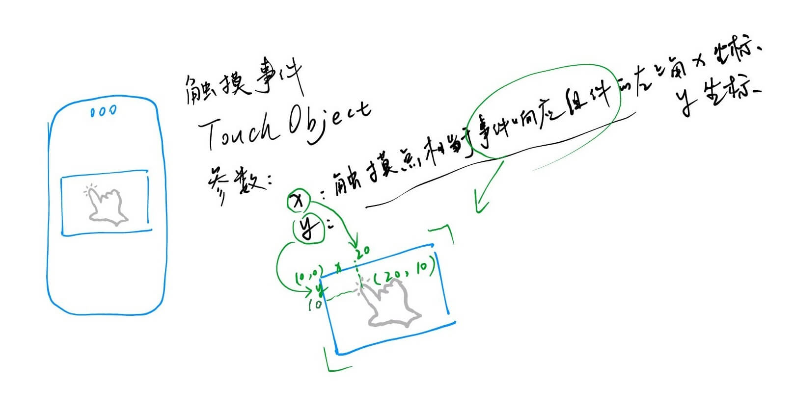
手指按下之后,onTouch() 事件是持续触发的。
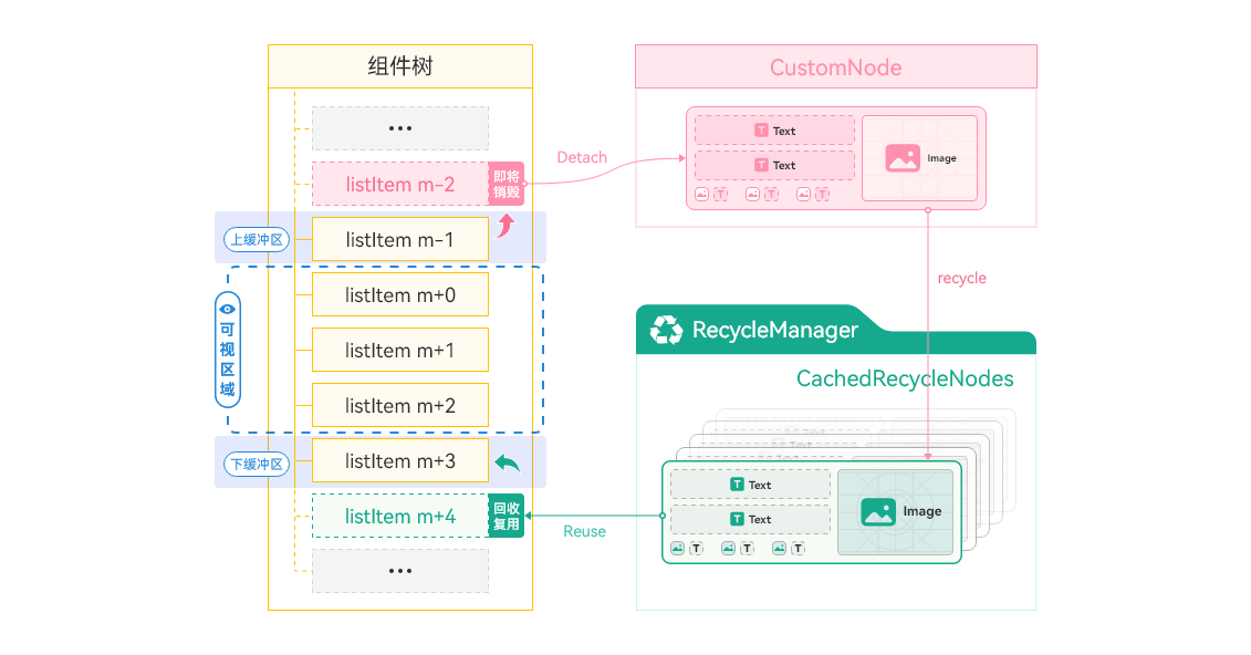
LazyForEach数据懒加载
List、LazyForEach + @Reusable(组件复用)实现数据懒加载的性能最优化。先看看官方文档吧,目前不太理解...
ForEach、LazyForEach刷新原理:修改了数据源并通知Listener(仅限LazyForEach)之后,ForEach或LazyForEach会捕捉到key(需要正确处理keyGenerator) 的变化,从而通过重建组件节点来刷新。
- 指南:LazyForEach:数据懒加载
- api:LazyForEach-状态管理与渲染控制
- 组件复用最佳实践:组件复用-自定义组件上面加上@Reusable注解
组件复用就是在页面创建的时候一共创建:页面显示数量+List的cachedCount个可复用组件,在滑动至不可见位置时,组件被回收,待复用的时候就不用重新创建组件了。(有一个坑,详情见:[坑:组件复用 @Reusable](#####组件复用 @Reusable))
事件冒泡
CommonAppDevelopment/feature/eventpropagation · HarmonyOS-Cases/Cases
onClick()
点击事件中,当子组件触发点击事件的时候,父组件如果设置点击事件的话,也会触发;
对设置了onClick属性的组件,例如Button组件,在Button组件外包裹一层容器组件,并设置hitTestBehavior属性, 属性值设置为HitTestMode.Block,可阻止事件的冒泡(和JS一样,子组件向父组件透传onClick事件)。// 这里假如`Column`外面有一层父组件,并且设置了`onClick`事件 Column() { Button('onClick测试') // enabled的值为false时,点击Button按钮,也会导致父组件的点击事件触发 .enabled(false) .onClick(() => { }) } // 这里条件设置为HitTestMode.Block后,就阻止事件冒泡行为了,则父组件的`onClick`事件不会触发 .hitTestBehavior(this.isEnabled ? HitTestMode.Block : HitTestMode.Default)onTouch()
触摸事件中,当子组件触发触摸事件的时候,父组件如果设置触摸事件的话,也会触发;
在onTouch函数中执行event.stopPropagation()可阻止冒泡。// 这里假如`Text`外面有一层父组件,并且设置了`onTouch`事件 Text('onTouch测试') .onTouch((event) => { if (this.isEnabled) { // 通过调用event.stopPropagation()阻止事件冒泡,则父组件的`onTouch`事件不会触发 event.stopPropagation(); } this.childCompResponseTimes++; })
应用兼容性
重要
可以先看一下:应用兼容性说明。因为应用兼容性是多个方面综合下来的体现,需要了解一下设备SDK(API)版本、应用最低兼容SDK版本、目标SDK版本等多个方面对应用实际运行时行为的影响。这里简单说两种情况:
低版本开发运行在高版本设备
如果你的应用没有使用更高API的组件,并且DevEco Studio中没有修改应用API版本相关配置(
compatibleSdkVersion、targetSdkVersion等),一般不用考虑目标设备运行上的兼容性问题。不过有以下例外情况:API在不断演进迭代过程中,因体验优化或安全等因素,可能会发生行为变更(变更要求应用适配并且未做 版本隔离 ),并对已上架应用产生影响,针对这部分变更会专门在 版本说明 中详细阐述。开发者需要按照变更说明中的适配指导进行应用适配。
高版本开发运行在低版本设备
使用当前设备API版本(针对OpenHarmony底座公共接口)判断:API-兼容性
⌈‾‾‾‾‾‾↓‾‾‾‾‾‾⌉
以下几个知识点都在这个项目中都有使用到
Want
快捷方式
桌面长按APP图标快捷方式
Deep Linking
- Deep Linking 基于隐式Want匹配机制中的uri匹配来查询、拉起目标应用。
- 隐式Want匹配原理。
Button('DeepLink拉起哔哩哔哩')
  .id('openAbilityWechat')
  .onClick(() => {
    let context = this.getUIContext().getHostContext() as common.UIAbilityContext;
    // let link: string = "weixin://home";
    let link: string = "bilibili://home";
    let openLinkOptions: OpenLinkOptions = {
      // true:仅应用链接跳转; false:支持Deep Linking兜底
      appLinkingOnly: false
    };

    try {
      context.openLink(link, openLinkOptions)
        .then(() => {
          hilog.info(DOMAIN_NUMBER, TAG, 'Button#onClick():openLink success.');
        })
        .catch((err: BusinessError) => {
        	hilog.error(DOMAIN_NUMBER, TAG, `Button#onClick():openLink failed. Code is ${err.code}, message is ${err.message}`);
      });
    } catch (paramError) {
      hilog.error(DOMAIN_NUMBER, TAG, `#ERROR:Button#onClick():Failed to start link. Code is ${paramError.code}, message is ${paramError.message}`);
    }
  })
提示
查询本设备所有能使用的 App Linking
hdc shell hidumper -s AppDomainVerifyManager
Notification Kit
本地通知。
参考下方 Push Kit 中的示例仓库。
Push Kit(进入应用内页)
代码仓库:https://gitcode.com/hmos-dev/notification_demo.git ,项目中也包含本地通知 Notification Kit 的使用示例。
代码中点击通知进入应用内页在 本地通知 使用的Want显式匹配规则,云侧通知 使用的Want隐式匹配规则。
前提:
AppGallery Connect 创建应用的时候选择了
Push Kit服务;使用上述应用的证书和对应设备进行真机调试;
模块级modele.json5配置一个新的skill对象
// module.abilities.skills 下
// 配置一个新的 skill,用于接收`Push Kit`消息。配置自定义actions参数
{
  "actions": [
    // 这个可以自定义,用于配对 发起通知的 `REST API` 里的 `clickAction.action`。
    "test.action.push.kit"
  ],
  // 这个用于配对 发起方使用App Linking、Deep Linking 的时候的want中的uri。
  "uris": [
    {
      "scheme": "link",       // 必填,自定义协议(如link/https)
      "host": "www.example.com", // 必填,域名
      "path": "detail",        // 可选,路径
      "query": "page=home"     // 可选,查询参数
    }
  ]
}
注意
注意:
actions和uris配置任意一个就行了,如果需要匹配uris,则actions必须为空字符串。测试时,获取到真机的
Push Token(这样推送服务器才知道该推送给哪个设备);// 通知携带的额外数据类型,不是必须的 export interface ExtraData { time: string; amount: string; targetPage: string; pushKitTestKey: string; }// Push Kit (云侧推送) 实现 import { AbilityConstant, UIAbility, Want } from '@kit.AbilityKit' import { notificationManager } from '@kit.NotificationKit'; import { PromptAction, window } from '@kit.ArkUI'; import { pushService } from '@kit.PushKit'; import { BusinessError } from '@kit.BasicServicesKit'; import { hilog } from '@kit.PerformanceAnalysisKit'; const DOMAIN_NUMBER: number = 0xBBBB; const TAG: string = 'PushAbility' export default class PushAbility extends UIAbility { private promptAction: PromptAction = new PromptAction(); // want目标页面 private targetPage: string = ''; // 冷启动入口 onCreate(want: Want, launchParam: AbilityConstant.LaunchParam): void { hilog.info(DOMAIN_NUMBER, TAG, `#onCreate(): want.parameters is ${JSON.stringify(want.parameters)}`) AppStorage.setOrCreate('wantParam', want.parameters); this.getPushToken(); this.receiveMessage(); } // 热启动入口 onNewWant(want: Want, launchParam: AbilityConstant.LaunchParam): void { hilog.info(DOMAIN_NUMBER, TAG, `#onNewWant(): want.parameters is ${JSON.stringify(want.parameters)}`) this.targetPage = want.parameters?.targetPage as string || ''; if (this.targetPage.trim().length !== 0) { // 获取当前路由页面 const currentPage: string = AppStorage.get<string>('pushKitCurrentPage') || '' // 获取首页Navigation页面栈 const pushKitPageInfos: NavPathStack | undefined = AppStorage.get<NavPathStack>('pushKitPageInfos'); if (undefined == pushKitPageInfos) { return; } // 判断是否需要路由 if (this.targetPage.trim().length !== 0 && currentPage !== this.targetPage && this.targetPage !== 'PushIndex') { hilog.info(DOMAIN_NUMBER, TAG, `#routerByNewWant#pushPathByName(${this.targetPage})`) pushKitPageInfos.pushPathByName(this.targetPage, null) } // 存储新的want信息 AppStorage.setOrCreate('wantParam', want.parameters); // 更新当前路由页面 AppStorage.setOrCreate<string>('currentPage', this.targetPage); } } async onWindowStageCreate(windowStage: window.WindowStage): Promise<void> { hilog.info(DOMAIN_NUMBER, TAG, `#onWindowStageCreate()`) // 默认页面路径 let pageUrl = 'PushIndex'; // 根据参数决定加载哪个页面 if (this.targetPage === 'PushPage4') { // 收款码页面直接load pageUrl = this.targetPage } // 记录当前页面url AppStorage.setOrCreate<string>('currentPage', pageUrl); await windowStage.loadContent(`pages/${pageUrl}`) .then(() => { hilog.info(DOMAIN_NUMBER, TAG, `#onWindowStageCreate#windowStage.loadContent(${pageUrl}): Successfully!`) this.promptAction = windowStage.getMainWindowSync()?.getUIContext()?.getPromptAction(); }) .catch((error: BusinessError) => { hilog.error(DOMAIN_NUMBER, TAG, `ERROR: #onWindowStageCreate#windowStage.loadContent(${pageUrl}), Cause: ${JSON.stringify(error)}`); }); // 申请通知权限 await this.requestEnableNotification(); } /** * 申请系统通知权限 */ private async requestEnableNotification(): Promise<void> { try { await notificationManager.requestEnableNotification(this.context); hilog.info(DOMAIN_NUMBER, TAG, `Succeeded in requesting enable notification`) } catch (e) { const err: BusinessError = e; hilog.error(DOMAIN_NUMBER, TAG, `Failed to request enable notification: ${err.code}, ${err.message}`) } } /** * 获取Push Token */ async getPushToken() { let pushToken: string = '' try { pushService.getToken() .then((result: string) => { // TODO 生产使用的时候需要上报该token给应用服务器 pushToken = result hilog.info(DOMAIN_NUMBER, TAG, `#pushService.getToken(): Succeeded in getting push token: ${pushToken}`) }) .catch((error: BusinessError) => { hilog.error(DOMAIN_NUMBER, TAG, `#Error#pushService.getToken(): Failed to get push token:${JSON.stringify(error)}`) }) } catch (err) { let error: BusinessError = err as BusinessError; hilog.error(DOMAIN_NUMBER, TAG, `#Error#getPushToken(): Failed to get push token:${JSON.stringify(error)}`) } // 上报Push Token并上报到您的服务端 } /** * 根据不同场景接收相应的推送消息 * Receives scenario-specific messages from Push Kit */ private receiveMessage(): void { try { pushService.receiveMessage('IM', this, (payload) => { try { hilog.info(DOMAIN_NUMBER, TAG, `#receiveMessage(): type: ${payload.type}`) // 从通知请求REST API中获取额外数据 const extraData: ExtraData = JSON.parse(JSON.parse(payload.data).data); hilog.info(DOMAIN_NUMBER, TAG, `#receiveMessage(): extraData: ${extraData}`) // TODO: modify it based on your service scenario this.promptAction.showToast({ message: $r('app.string.express_message', extraData.time, extraData.amount), duration: 5000, }); } catch (e) { const err: BusinessError = e; hilog.error(DOMAIN_NUMBER, TAG, `#ERROR#receiveMessage(): Failed to process message: ${err.code}, ${err.message}`) } }); } catch (e) { const err: BusinessError = e; hilog.error(DOMAIN_NUMBER, TAG, `#ERROR:#receiveMessage(): Failed to receive message: ${err.code}, ${err.message}`) } } } export interface ExtraData { time: string; amount: string; targetPage: string; pushKitTestKey: string; }
指南:
示例代码:根据上方链接生成的鉴权json,生成
PushJwtToken,用于推送服务REST API时放在Authorization头部来进行鉴权。# 依赖:pip install PyJWT cryptography import jwt import json import time from cryptography.hazmat.primitives import serialization def load_private_key_from_json(json_file_path): """ 从JSON文件中加载私钥信息 :param json_file_path: JSON文件路径 :return: (key_id, sub_account, private_key_pem) """ with open(json_file_path, 'r') as f: data = json.load(f) # 获取KID和ISS key_id = data.get('key_id') sub_account = data.get('sub_account') # 将私钥转换为PEM格式 private_key_str = data.get('private_key') private_key_pem = serialization.load_pem_private_key( private_key_str.encode(), password=None ) return key_id, sub_account, private_key_pem def generate_jwt_token(json_file_path): # 从JSON文件加载信息 kid, iss, private_key = load_private_key_from_json(json_file_path) # 当前时间和过期时间(示例中使用固定值,实际应根据需求计算) iat = int(time.time()) exp = iat + 3600 # 构造Header header = { "kid": kid, "typ": "JWT", "alg": "PS256" } # 构造Payload payload = { # 实际开发时请将公网地址存储在配置文件或数据库 "aud": "https://oauth-login.cloud.huawei.com/oauth2/v3/token", "iss": iss, "exp": exp, "iat": iat } # 生成JWT Token token = jwt.encode( payload=payload, key=private_key, algorithm='PS256', headers=header ) return token def send_message(jwt_token): # 自行实现业务流程 pass if __name__ == "__main__": json_file = "private.json" # 替换为实际JSON文件路径,此处以本文件同级目录为例 try: # jwt_token 为鉴权令牌,调用推送服务REST API时放在Authorization头部来进行鉴权。 jwt_token = generate_jwt_token(json_file) print(f'PushKit JwtToken is:{jwt_token}') send_message(jwt_token) except Exception as e: print(f"Error generating JWT token: {str(e)}")
API:
场景化消息
REST API
url:https://push-api.cloud.huawei.com/v3/{项目id}/messages:send请求头:
// Request Header
{
  Content-Type: application/json
  Authorization: Bearer xxx
  // 打开应用内页必须为 1
  push-type: 1
}
示例请求体json:
{
  "payload": {
    "notification": {
      "category": "IM", // category替换为实际通知消息类型
      "title": "Push Kit 测试消息标题",
      // 换行\n
      "body": "Push Kit 消息内容🥳\n0123456789{\"a\":\"bb\"}",

      // APP icon 红点 打开应用或者点击、清理通知消息并不会清理角标数字,开发者可通过setBadgeNumber()方法清理角标,使用前需先导入模块import { notificationManager } from '@kit.NotificationKit';。 当setBadgeNumber()方法中的badgeNumber设置为0时,可以实现清理效果。
      "badge": {
        // 应用角标累加数字,非应用角标实际显示数字。
        "addNum": 1,
        // 应用角标实际显示数字。setNum优先级高于addNum。
        "setNum": 233
      },

      "style": 0,
      // 支持的图片格式为PNG、JPG、JPEG、BMP,图片长*宽建议小于128*128像素,若超过49152像素,则图片不展示。
      // "image": "https://***.png",

      "clickAction": {
        // 0 打开首页;1-自定义action页面
        "actionType": 1,
        // 匹配module.json5中对应UIAbility内的自定义skills.actions
        "action": "test.action.push.kit",
        "data": {
          "pushKitTestKey": "pushKitTestValue",
          // 目标页面
          "targetPage": "PushPage2",
          // UIAbility指定实例模式(启动时动态设置)UIAbility的实例key(KEY_COMMON: 公用实例; KEY_ALONE: 单独实例);
          "instanceKey": "KEY_ALONE"
        }
      },
      // 设置为false则应用在前台时不会展示通知消息
      "foregroundShow": true,
    }
  },
  "target": {
    // 最多1000个。设备首次启动应用onCreate的时候,调用pushService.getToken()获取token,注如果应用重装之后token就会刷新。
    "token": [
      ""
    ]
  },
  "pushOptions": {
    // 测试消息,每天1000条上限
    "testMessage": true,
  }
}
应用在前台时处理通知消息
为实现应用在后台时展示通知消息,在前台时只接收通知消息并自行完成业务处理,需要服务端和客户端协同配置,具体步骤可以参考以下:
服务端调用REST API推送通知消息,消息体中携带foregroundShow字段,并且设置为
false(默认为true,表示前后台都展示),则应用在前台时不会展示通知消息。{ "payload": { "notification": { // category替换为实际通知消息类型 "category": "IM", "title": "普通通知标题", "body": "普通通知内容", "clickAction": { "actionType": 0 }, // 设置为 `false` 则应用在前台时不会展示通知消息 "foregroundShow": false } }, "target": { "token": ["MAMzLg**********lPW"] }, "pushOptions": { "testMessage": true } }在客户端项目模块级
module.json5文件的对应Ability配置中(以PushMessageAbility为例),skills标签的actions属性内容配置为action.ohos.push.listener。警告
- 必须为此字符串
- 项目中有且只能有一个Ability定义该action
{
  "name": "PushMessageAbility",
  "srcEntry": "./ets/abilities/PushMessageAbility.ets",
  // 必须为单例模式
  "launchType": "singleton",
  "startWindowIcon": "$media:startIcon",
  "startWindowBackground": "$color:start_window_background",
  "exported": false,
  "skills": [
    // 保持现有skill对象不变
    {
      "actions": [
        "com.app.action"
      ]
    },
    // 新增一个独立的skill对象,配置actions参数
    {
      "actions": [
        "action.ohos.push.listener"
      ]
    }
  ]
}
在客户端项目中,在通过步骤2配置了actions的
UIAbility#onCreate()方法中(以PushMessageAbility为例),通过receiveMessage()方法传入PushType为"DEFAULT"获取通知消息,用于应用在前台时接收通知消息,示例代码如下:// 文件路径: src/main/ets/abilities/PushMessageAbility.ets import { UIAbility } from '@kit.AbilityKit'; import { pushService } from '@kit.PushKit'; import { BusinessError } from '@kit.BasicServicesKit'; import { hilog } from '@kit.PerformanceAnalysisKit'; /** * 此处以PushMessageAbility为例,用于应用在前台时接收通知消息 */ export default class PushMessageAbility extends UIAbility { onCreate(): void { try { // receiveMessage中的参数固定为DEFAULT pushService.receiveMessage('DEFAULT', this, (payload) => { try { // 获取服务端传递的数据 const data: string = payload.data; // TODO:业务自行处理 hilog.info(0x0000, 'testTag', 'Succeeded in getting notification,data=%{public}s', JSON.stringify(JSON.parse(data)?.notification)); } catch (e) { let errRes: BusinessError = e as BusinessError; hilog.error(0x0000, 'testTag', 'Failed to process data: %{public}d %{public}s', errRes.code, errRes.message); } }); } catch (err) { let e: BusinessError = err as BusinessError; hilog.error(0x0000, 'testTag', 'Failed to get message: %{public}d %{public}s', e.code, e.message); } } }
重要
有一个必要条件之前在官方文档里没有列出,后面修改了文档也没有特意说明:
使用
Push Kit功能的UIAbility启动模式必须为单例模式模块级
module.json5:{ "module": { "abilities": [ { // 单实例模式(默认模式,即使没有显式指定) "launchType": "singleton", } ] } }
否则即使按照官方文档的要求发送api请求,APP在前台收不到通知。
⌊______↑______⌋
动作感知(左右手触摸、握持)
- 动作感知:@ohos.multimodalAwareness.motion (动作感知)
- ClickEvent:点击事件(查看其中
hand属性)
提示
经过我个人测试,感觉这个应该是按照手指接触面来判断的左右手指。因为右手硬是别过来按照左手的姿势触摸判断到的也是左手
NFC 拉起应用
指南:后台读取标签-NFC(前后台读取区别可以看下方项目的README)
项目:NFC-tag
论坛:如何实现碰一碰NFC标签拉起指定应用,并跳转到指定页面
修改NFC数据
// 调用 tag.ndef.makeExternalRecord 接口,按以下格式向NFC卡片写入包名:
// 需要替换为实际包名
tag.ndef.makeExternalRecord("ohos.com", "pkg", ["com.xxx.xxxx"])
--------
ArkUI
链接
资源访问
对于 string.json 中有占位符的情况,可以用以下方式替代占位符字符:
// 对于string.json中name为"message_notification",value为"Hello, %1$s!,You have %2$d new messages."
// 该资源存在$s、$d两个占位符,需要替代为'LiHua'、2,则采用如下方式访问
Text($r('app.string.message_notification', 'LiHua', 2))
名词
- 骨架屏: 页面防止长时加载资源先画出骨架图,用和实际显示效果一样的色块填满屏幕给用户一种加载中并且加载快的感觉。
自定义组件 & @Entry
@Entry装饰的自定义组件将作为UI页面的入口。在单个UI页面中,最多可以使用@Entry装饰一个自定义组件。@Entry可以接受一个可选的 LocalStorage 的参数。
如果使用router的命名路由跳转选项,则需要配置参数:
EntryOptions10+
命名路由跳转选项。
| 名称 | 类型 | 必填 | 说明 |
|---|---|---|---|
| routeName | string | 否 | 表示作为命名路由页面的名字。 |
| storage | LocalStorage | 否 | 页面级的UI状态存储。 |
| useSharedStorage12+ | boolean | 否 | 是否使用 LocalStorage.getShared() 接口返回的 LocalStorage 实例对象,默认值 false 。 |
提示
当 useSharedStorage 设置为 true ,并且 storage 也被赋值时,useSharedStorage 的值优先级更高。
 @Entry({ routeName : 'myPage' })
 @Component
 struct MyComponent {
   // ...
 }
成员函数/变量
自定义组件除了必须要实现 build() 函数外,还可以实现其他成员函数,成员函数具有以下约束:
- 自定义组件的成员函数为 私有的 ,且 不建议声明成静态函数 。
自定义组件可以包含成员变量,成员变量具有以下约束:
- 自定义组件的成员变量为 私有的 ,且 不建议声明成静态变量 。
- 自定义组件的成员变量是否需要 本地初始化 、 从父组件通过参数传递初始化 ,请参考 状态管理 。
Column()
沿垂直方向布局的容器。可以理解为只有一列,子元素全都挨边往下排;
width和height可以用动态计算方式:.width(`calc(100% - ${BIND_SHEET_TITLE_LEFT_SYMBOL_WEIGHT}vp)`)可以设置为
'auto',表示可以被子组件撑开;
Row()
沿水平方向布局的容器。可以理解为是只有一行,子元素全都挨边往右排;
width和height可以用动态计算方式:.width(`calc(100% - ${BIND_SHEET_TITLE_LEFT_SYMBOL_WEIGHT}vp)`)可以设置为
'auto',表示可以被子组件撑开;
Stack()
层叠容器 ,后定义的子组件会覆盖在先定义的组件之上(后来居上)。
提示
同一容器内的兄弟组件可以通过 Z序控制 的 zIndex 属性改变堆叠顺序,zIndex 值越大,显示层级越高,即 zIndex 值大的组件会覆盖在 zIndex 值小的组件上方。
子元素与容器对齐方式(默认值
Alignment.Center):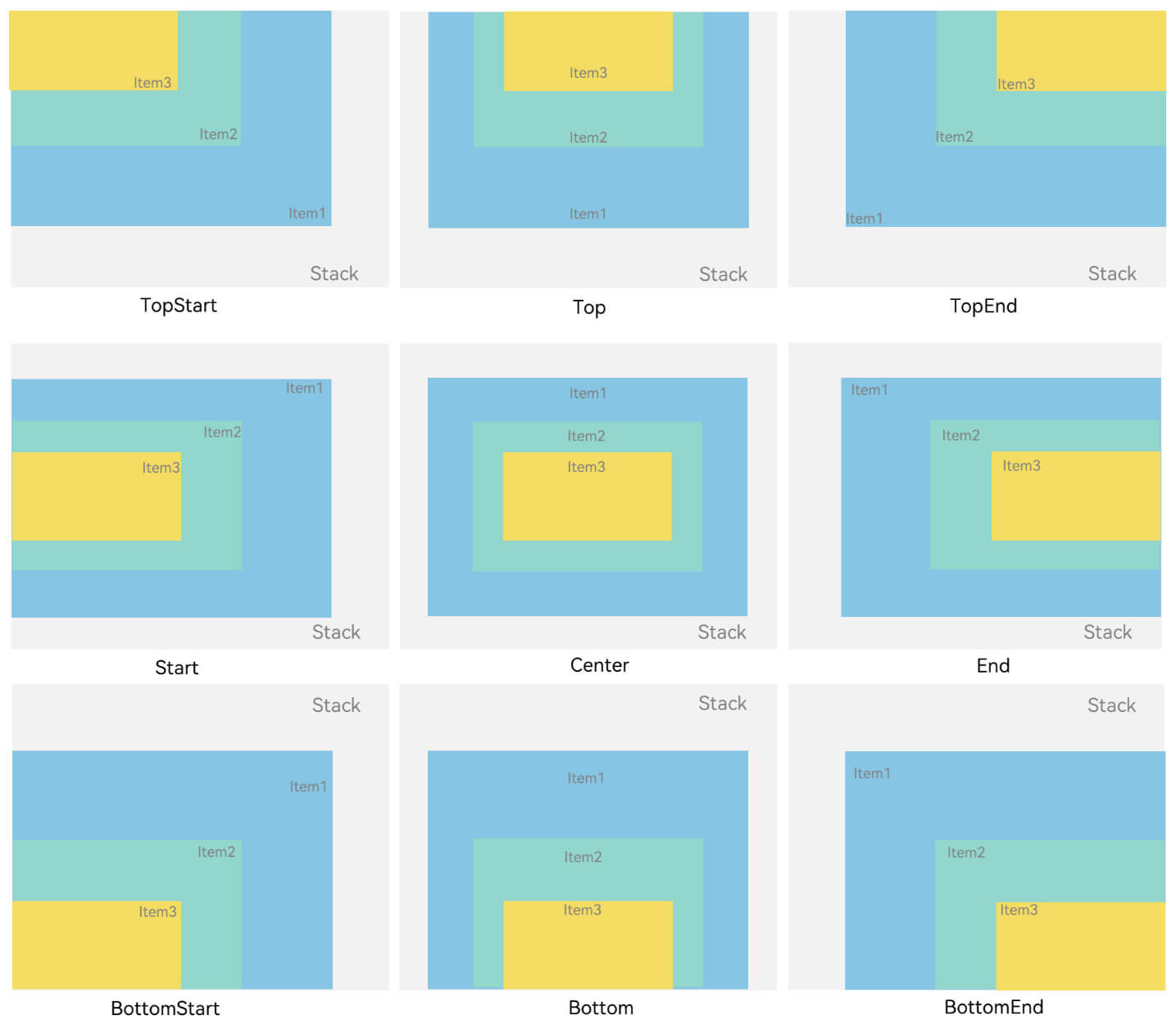
子组件偏移:将 对齐方式 抽象为一个点,子组件相对于这个点的偏移:
Stack({ alignContent: Alignment.TopStart }){
  Text('text')
    .fontSize(14)
    .size({ width: 25, height: 25 })
  	// 以TopStart容器左上角为原点(0, 0),x和y大于0,Text往左上方向偏移;x和y小于0,Text组件往右下偏移。
    .markAnchor({ x: 25, y: 25 })
}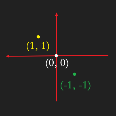
RelativeContainer()
基本概念
- 锚点:通过锚点设置当前元素基于哪个元素确定位置。
- 对齐方式:通过对齐方式,设置当前元素是基于锚点的上中下对齐,还是基于锚点的左中右对齐。
设置依赖关系
容器内子组件区分水平方向,垂直方向
水平方向为
left/(推荐用start),middle,right/ (推荐用end),对应容器的HorizontalAlign.Start,HorizontalAlign.Center,HorizontalAlign.End。垂直方向为
top,center,bottom,对应容器的VerticalAlign.Top,VerticalAlign.Center,VerticalAlign.Bottom。名称 类型 描述 start LocalizedHorizontalAlignParam 设置横向对齐方式的参数,LTR模式时为左对齐,RTL模式时为右对齐。对应下图:HorizontalAlign.Start | Center | End end LocalizedHorizontalAlignParam 设置横向对齐方式的参数,LTR模式时为右对齐,RTL模式时为左对齐。对应下图:HorizontalAlign.Start |Center |End middle LocalizedHorizontalAlignParam 设置横向居中对齐方式的参数。 对应下图:HorizontalAlign.Start |Center |End 分割行,仅用于区分横向和纵向对齐的属性 top LocalizedVerticalAlignParam 设置纵向顶部对齐的参数。 对应下图:VerticalAlign.Top | Middle | Bottom bottom LocalizedVerticalAlignParam 设置纵向底部对齐的参数。 对应下图:VerticalAlign.Top |Middle |Bottom center LocalizedVerticalAlignParam 设置纵向居中对齐方式的参数。 对应下图:VerticalAlign.Top |Middle |Bottom bias Bias 设置组件在锚点约束下的偏移参数,其值为到左/上侧锚点的距离与锚点间总距离的比值。
设置相对于锚点的对齐位置
设置了锚点之后,可以通过
align设置相对于锚点的对齐位置。在水平方向上,对齐位置可以设置为
HorizontalAlign.Start、HorizontalAlign.Center、HorizontalAlign.End。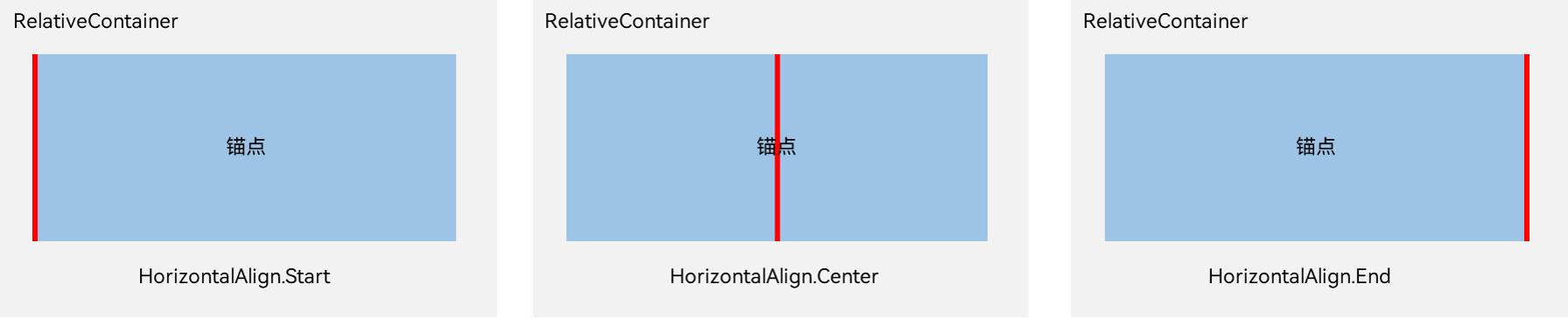
在竖直方向上,对齐位置可以设置为
VerticalAlign.Top、VerticalAlign.Center、VerticalAlign.Bottom。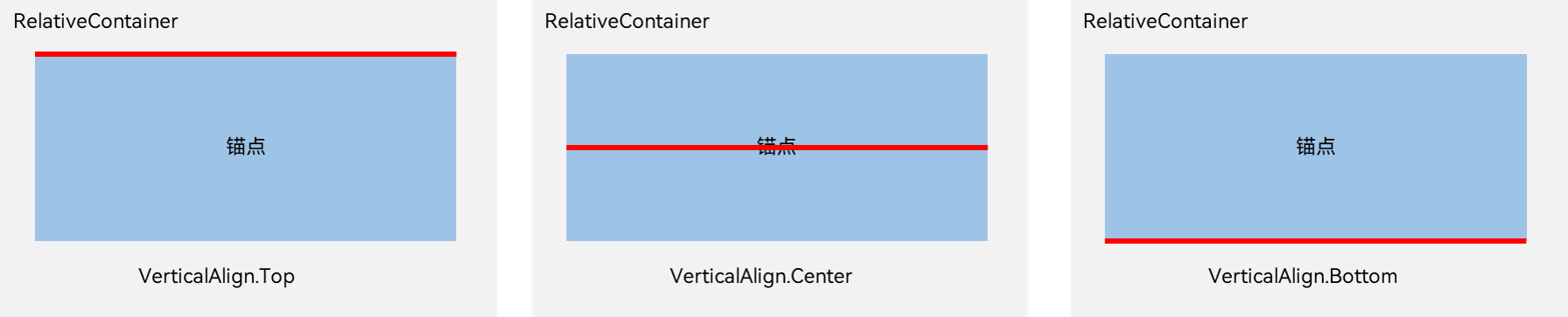
使用方式:主要在于
alignRules的配置:警告
一个元素内的四个边的锚点可以任意选择四个边分别依赖四个不同的元素,但切记不可相互依赖。
build() {
    Stack(){
      // 页面十字线 START
      Divider().strokeWidth(1).vertical(true).height('100%').color($r('sys.color.font_tertiary'))
      Divider().strokeWidth(1).vertical(false).width('100%').color($r('sys.color.font_tertiary'))
      // 页面十字线 END

      // 相对布局 START
      RelativeContainer() {
        Column(){ Text('square_1').fontSize(18) }
        .id('square_1')
        .width(150)
        .height(150)
        .backgroundColor('#ff9cb5ff')
        // Column()设置子组件在水平方向上的对齐格式, Row()设置子组件在垂直方向上的对齐格式
        .alignItems(HorizontalAlign.Start)
        // Column()设置子组件在主轴方向上的对齐格式, Row()设置子组件在主轴方向上的对齐格式
        .justifyContent(FlexAlign.Center)
        // 在相对容器中子组件的对齐规则,仅当父容器为RelativeContainer时生效
        .alignRules({
          start: { anchor: '__container__', align: HorizontalAlign.Center},
          // center: { anchor: '__container__', align: VerticalAlign.Center },
          // bottom: { anchor: '__container__', align: VerticalAlign.Top },
        })
        Column(){ Text('square_2\n高度100,宽度跟随锚点元素`square_1`').fontSize(18) }
        .id('square_2')
        // .width(150)
        .height(100)
        .backgroundColor('#ffa2ffaf')
        .alignItems(HorizontalAlign.Start)
        .alignRules({
          // 一一对应关系,自身的`start`边,对应在锚点元素的`水平方向`上的`Start`边上
          start: { anchor: 'square_1', align: HorizontalAlign.Start },
          // 一一对应关系,自身的`end`边,对应在锚点元素的`水平方向`上的`End`边上
          end: { anchor: 'square_1', align: HorizontalAlign.End },
          // 一一对应关系,自身的`top`边,对应在锚点元素的`垂直方向`上的`Bottom`边上
          // `anchor`可以为其他元素,不是必须都写`square`
          top: { anchor: 'square_1', align: VerticalAlign.Bottom }
        })
      }
      // 相对布局 END
    }
}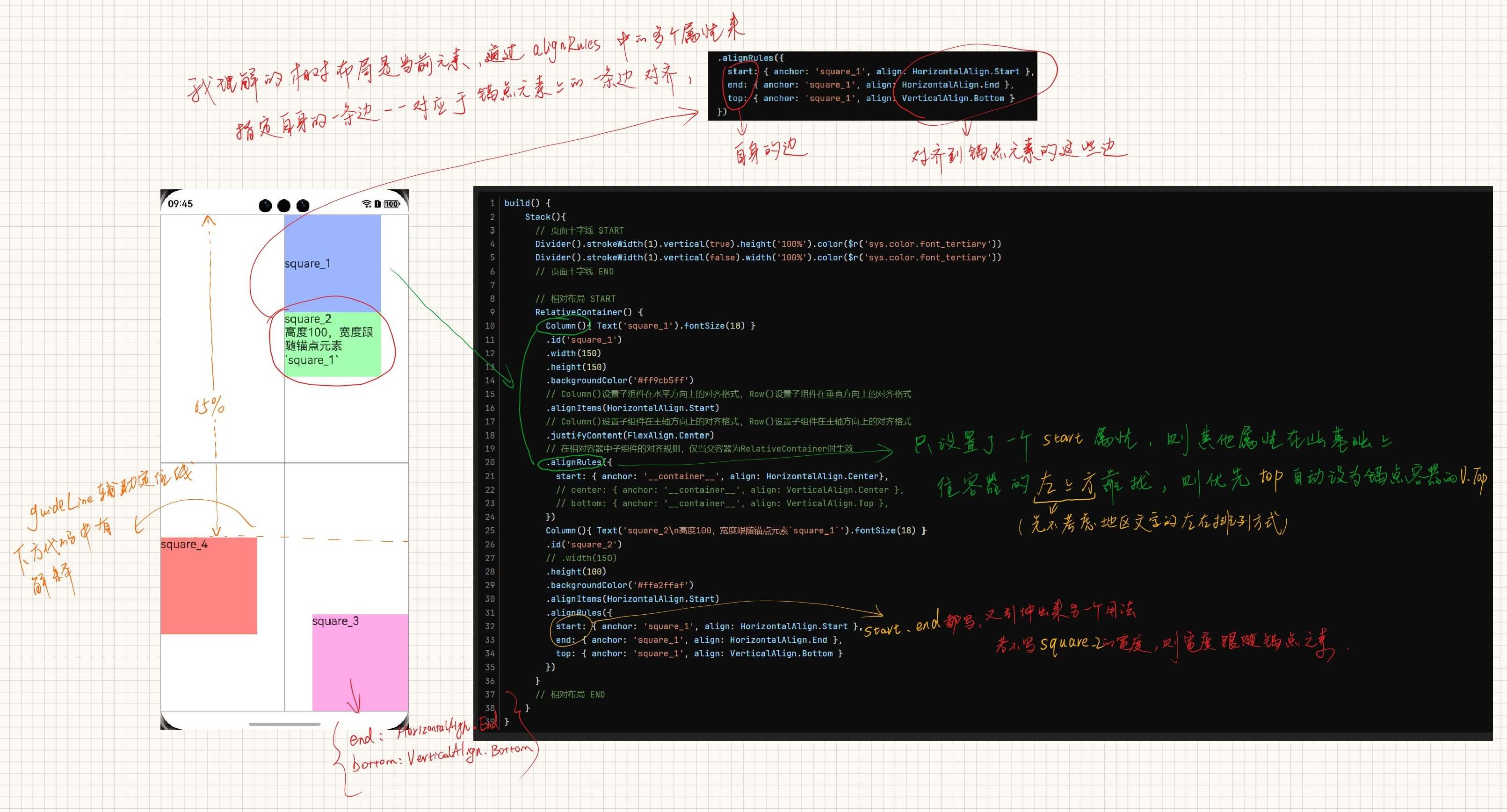
guideLine: 辅助定位线(1. 在没有组件方便定位、2. 不以其他子组件作为锚点定位的情况下使用)RelativeContainer(){ // ... } .guideLine([ /** * position: * start: `guideline`距离容器左侧或者顶部的距离,这是水平线,所以这是距离容器顶部的距离 * end: `guideline`距离容器右侧或者底部的距离,这是水平线,所以是距离容器底部的距离 * 但是经测试,start和end同时填的话,只会生效start,所以只需要按需设置一个就行了 * 这一条相当于在这个相对容器内设置了一条水平辅助线,子组件可以用id来进行定位, * 实例中这个线的顶部距离容器顶部65%的距离. */ { id: 'guide_line_horizontal', direction: Axis.Horizontal, position: { start: '65%' } }, { id: 'guide_line_vertical', direction: Axis.Vertical, position: { start: 0, end: 0 } }, ])子组件的宽的和高度
ForEach()
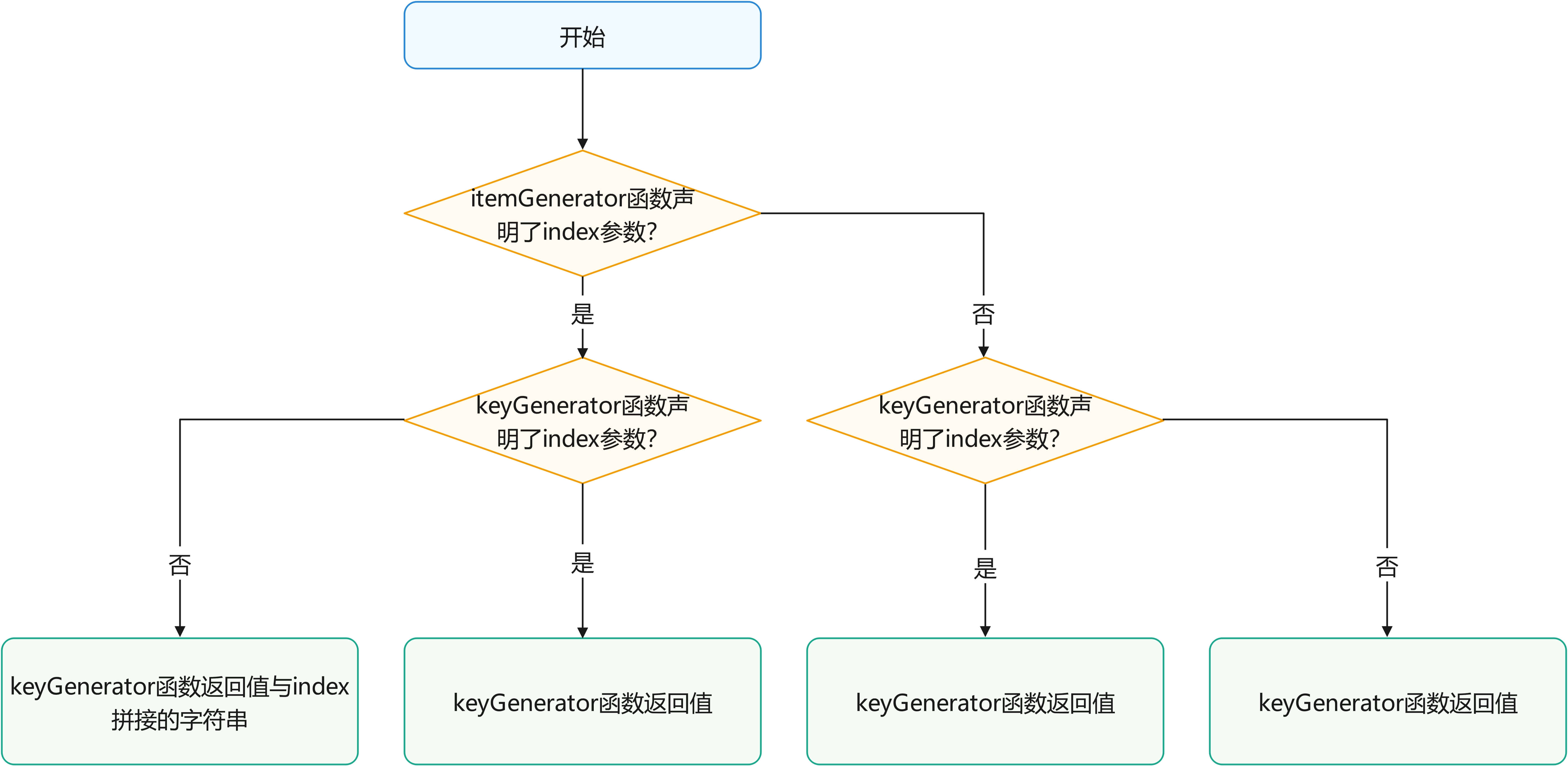
ForEach键值生成规则(相同键值的组件首次不会被渲染\非首次不会重新渲染,也有可能导致框架无法正常工作):
自定义组件通用样式
@Component
struct ChildComponent {
  build() {
    Button(`Hello World`)
  }
}

@Entry
@Component
struct MyComponent {
  build() {
    Row() {
      ChildComponent()
        .width(200)
        .height(300)
        .backgroundColor(Color.Red)
    }
  }
}
警告
ArkUI 给自定义组件设置样式时,相当于给 ChildComponent 套了一个不可见的容器组件,而这些样式是设置在容器组件上的,而非直接设置给 ChildComponent 的 Button 组件。通过渲染结果我们可以很清楚的看到,背景颜色红色并没有直接生效在 Button 上,而是生效在 Button 所处的开发者不可见的容器组件上。
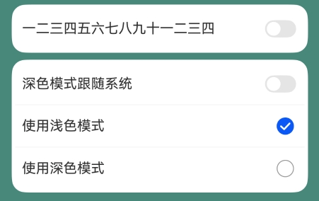
深色模式适配
// LIGHT 1
this.getUIContext().getHostContext()?.getApplicationContext().setColorMode(ConfigurationConstant.ColorMode.COLOR_MODE_LIGHT)
// DARK 0
this.getUIContext().getHostContext()?.getApplicationContext().setColorMode(ConfigurationConstant.ColorMode.COLOR_MODE_DARK)
// 跟随系统
this.getUIContext().getHostContext()?.getApplicationContext().setColorMode(ConfigurationConstant.ColorMode.COLOR_MODE_NOT_SET)
获取当前系统的颜色模式
EntryAbility.ets
onCreate(want: Want, launchParam: AbilityConstant.LaunchParam): void {
    AppStorage.setOrCreate('systemColorMode', this.context.config.colorMode);
}

// 配置更新(如在控制中心更改了颜色模式)
onConfigurationUpdate(newConfig: Configuration): void {
    AppStorage.setOrCreate('systemColorMode', newConfig.colorMode);
hilog.info(0x0000, 'EntryAbility', 'the newConfig.colorMode is [%{public}s] #COMMENT:[0: dark,1: light]', JSON.stringify(AppStorage.get('systemColorMode')) ?? '');
}
@Component
/* 当前系统颜色模式 */
@StorageProp('systemColorMode')
@Watch('onSystemColorModeChanged')
systemColorMode: ConfigurationConstant.ColorMode = ConfigurationConstant.ColorMode.COLOR_MODE_LIGHT;

onSystemColorModeChanged(): void {
    hilog.debug(0x1001, 'AboutPage', `#onSystemColorModeChanged:${this.systemColorMode}`)
    // if (this.systemColorMode === ConfigurationConstant.ColorMode.COLOR_MODE_LIGHT) {
    //   //当前为浅色模式,资源初始化逻辑
    // } else {
    //   //当前为深色模式,资源初始化逻辑
    // }
}
主题色
(以下为动态修改主题色,如果只需要进入系统之后改变一次主题色,只需要在下方代码中 CustomColors 实现类中填入需要复写需修改的部分即可,未修改内容将继承系统默认设置。可参考系统默认的token颜色值)
配置主题色
// AppTheme.ets
import { CustomColors, CustomTheme } from '@kit.ArkUI'
import { HashMap } from '@kit.ArkTS'


/* 主题定义 多个主题就创建多个*/
/* 鸿蒙蓝(星河蓝) blueAppTheme */
// 主题颜色
class BlueAppThemeColors implements CustomColors {
  iconEmphasize: ResourceColor = $r('sys.color.icon_emphasize')
}
// 主题配置
class BlueAppTheme implements CustomTheme {
  public colors: BlueAppThemeColors = new BlueAppThemeColors()
}

/* 哔哩粉 pinkAppTheme */
// 主题颜色
class PinkAppThemeColors implements CustomColors {
  iconEmphasize: ResourceColor = $r('app.color.theme_color_main_pink')
}
// 主题配置
class PinkAppTheme implements CustomTheme {
  public colors: PinkAppThemeColors = new PinkAppThemeColors()
}


/* 导出 */
// 自定义主题名称 TODO 补充主题名称字符串
export type CustomThemeName = 'blueAppTheme' | 'pinkAppTheme'
// 自定义主题HashMap
let _CUSTOM_THEME_MAP: HashMap<CustomThemeName, CustomTheme> = new HashMap<CustomThemeName, CustomTheme>()
_CUSTOM_THEME_MAP.set('blueAppTheme', new BlueAppTheme())
_CUSTOM_THEME_MAP.set('pinkAppTheme', new PinkAppTheme())

export const CUSTOM_THEME_MAP = _CUSTOM_THEME_MAP
在启动页初始化获取当前主题色配置
// Index.ets
// 主题色(示例中主题配置里配置了一个颜色,所以只用`ResourceColor`变量来接收色值,如果有多个颜色,就把这个变量换成`CustomTheme`类型的变量)
@Provide('icon_emphasize')
icon_emphasize: ResourceColor = $r('sys.color.icon_emphasize')

// 预留自定义主题,颜色在AppTheme里面修改
/**
 * 获取当前组件上下文的Theme对象,在build()函数之前执行。
 * @param theme
 */
onWillApplyTheme(theme: Theme) {
  hilog.info(0x1000, this.componentName, `#onWillApplyTheme`)
  this.icon_emphasize = theme.colors.iconEmphasize
}
使用
/* 主题色 */
@Consume('icon_emphasize') icon_emphasize: ResourceColor

build(){
  Text('示例文本')
    .fontColor(this.icon_emphasize)
}
动态更改主题色
/**
 * 更改主题配置
 * @param customThemeName 自定义主题的名字
 */
function changeThemeColor(customThemeName: CustomThemeName) {
  ThemeControl.setDefaultTheme(CUSTOM_THEME_MAP.get(customThemeName))
}
Blank()
空白填充组件,在容器主轴方向上,空白填充组件具有自动填充容器空余部分的能力。仅当父组件为Row/Column/Flex时生效。
父组件需要指定主轴方向上的单位(width 或 height)
Canvas()
CanvasRenderingContext2D-画布绘制-ArkTS组件-ArkUI
反色
let ctx = this.context
ctx.filter = 'invert(100%)';
// 图片, 左上角x坐标, 左上角y坐标, width, height
ctx.drawImage(img, 200, 100, 100, 100);
清除画布
// x, y, width, height
this.context.clearRect(30,30,150,100)
画圆
this.context().fillStyle = '#ffffff'
// 曲线圆:圆心x轴, 圆心y轴, 半径, 开始弧度, 结束弧度
this.context().arc(x, y, RADIUS, START_ANGLE, END_ANGLE)
// 填充圆:封闭路径填充
this.context().fill()
创建一个新图层
this.context.saveLayer()创建一个新的绘制路径(画一个新的圆或者新的图形之前调用)
this.context.beginPath()恢复图像变换和裁剪状态至
saveLayer()前的状态this.context.restoreLayer()缩放
// 水平方向的缩放值, 垂直方向的缩放值 (线的宽度也会按照这个缩放值进行加粗或减细)
this.context.scale(2, 2) // Scale to 200%
图像绘制
// ImageBitmap | PixelMap, 绘制区域左上角在x轴的位置, 绘制区域左上角在y轴的位置
this.context.drawImage(this.chordBasicImg, 0, 0)
代码备份
Canvas(this.canvasContext2D)
    .id('chordCanvas')
    .width(this.UIContext.px2vp(512))
    .height(this.UIContext.px2vp(640))
    .backgroundColor('#0798b3')
    .onReady(() => {
        let ctx = this.canvasContext2D
        ctx.clearRect(0, 0, this.chordCanvasWidth, this.chordCanvasHeight)
        // 绘制图片
        ctx.drawImage(this.chordBasicImg, 0, 0)

        // 重新开始路径
        ctx.beginPath()
        ctx.fillStyle = '#0055ff'
        ctx.arc(40, 20, 8, 0, 2 * Math.PI)
        ctx.fill()
    	// 要画多个点,复制line13-16即可

    	// 大横按(先画两个端点,然后重新开始路径,以两端点画一条直线,边框宽度等于端点的`半径*2`)
        // 重新开始路径
        ctx.beginPath()
        ctx.fillStyle = '#0055ff'
        ctx.arc(28, 50, 8, 0, 2 * Math.PI)
        ctx.arc(129.5, 50, 8, 0, 2 * Math.PI)
        ctx.fill()
        ctx.beginPath()
        ctx.lineWidth = 16
    	// 直线起点
        ctx.moveTo(28, 50)
    	// 到哪里
        ctx.lineTo(129.5, 50)
        ctx.strokeStyle = '#0055ff'
        ctx.stroke()
    })

// Canvas内部(x, y)点记录 (以下单位仅指Canvas内的 X、Y 轴px2vp前的数据,因为UI中和弦背景图是用的px2vp)

// 基准
7弦1品基准点:         (24, 160 + 16) // 左侧标记品位(没有7品,因为在6品左边,记为7品)
6弦0品基准点:         (90, 70) // 用文字标记此弦`X` | `O`的话就变成 (74, 82) 具体看代码:GuitarChordViewModel.ts
6弦1品基准点:         (90, 160) // 手指触点
(每弦间隔: 66, 每品间隔: 124)
代码备份(Canvas大横按,CounterComponent的x、y试试画Canvas实心圆)
// TODO 删除 绘制手指触点 XY 坐标
@State @Watch('onXValueChange')
private X: number = 1;
@State @Watch('onYValueChange')
private Y: number = 1;

// TODO 删除 START
Row() {
  Button('大横按').onClick(() => {
    let ctx = this.canvasContext2D
    ctx.clearRect(0, 0, this.chordCanvasWidth, this.chordCanvasHeight)
    // 绘制图片
    ctx.drawImage(this.chordBasicImg, 0, 0)
    // 重新开始路径
    ctx.beginPath()
    ctx.fillStyle = '#0055ff'
    ctx.arc(this.UIContext.px2vp(28), this.UIContext.px2vp(50), this.PX2VP_RADIUS, 0, END_ANGLE)
    ctx.arc(this.UIContext.px2vp(129.5), this.UIContext.px2vp(50), this.PX2VP_RADIUS, 0, END_ANGLE)
    ctx.fill()
    ctx.beginPath()
    ctx.lineWidth = this.UIContext.px2vp(RADIUS * 2)
    ctx.moveTo(this.UIContext.px2vp(28), this.UIContext.px2vp(50))
    ctx.lineTo(this.UIContext.px2vp(129.5), this.UIContext.px2vp(50))
    ctx.strokeStyle = '#0055ff'
    ctx.stroke()

    ctx.beginPath()
    ctx.fillStyle = '#ff00ff'
    ctx.arc(this.UIContext.px2vp(48.3), this.UIContext.px2vp(88), this.PX2VP_RADIUS, 0, END_ANGLE)
    ctx.fill()
  }).width(100)

  Button('获取chord-bg大小').onClick(() => {
    promptAction.showToast({
      message: `width:${this.chordBasicImg.width}\nheight:${this.chordBasicImg.height}`
    })
  }).width(200)
}.width('100%')

Column() {
  Row() {
    Text('X:')
    //列表型Counter
    CounterComponent({
      options: {
        type: CounterType.INLINE,
        inlineOptions: {
          min: 0,
          value: 1,
          max: Number.MAX_SAFE_INTEGER,
          textWidth: 100,
          onChange: (currentValue: number) => {
            this.X = currentValue
          }
        }
      }
    })
  }

  Row() {
    Text('Y:')
    //列表型Counter
    CounterComponent({
      options: {
        type: CounterType.INLINE,
        inlineOptions: {
          min: 0,
          value: 1,
          max: Number.MAX_SAFE_INTEGER,
          textWidth: 100,
          onChange: (currentValue: number) => {
            this.Y = currentValue
          }
        }
      }
    })
  }

  Row() {
    Button('获取两个index').onClick(() => {
      promptAction.showToast({
        message: `index#0: ${this.queryParamIndex0}\nindex#1: ${this.queryParamIndex1}`
      })
    })
  }
}.width('100%')
// TODO 删除 END


// TODO 删除 START
/** @Watch变量绑定事件
 * Canvas和弦手指触点的 X 轴坐标
 * @param changedPropertyName 被绑定的变量名
 */
onXValueChange(changedPropertyName: string) {
    promptAction.showToast({ bottom: 400, message: `X is : [${this.X}]` })
    this.updateTestFillArcDrawForChord()
}

/** @Watch变量绑定事件
 * Canvas和弦手指触点的 Y 轴坐标
 * @param changedPropertyName
 */
onYValueChange(changedPropertyName: string) {
    promptAction.showToast({ bottom: 400, message: `Y is : [${this.Y}]` })
    this.updateTestFillArcDrawForChord()
}

updateTestFillArcDrawForChord() {
    let ctx = this.canvasContext2D
    ctx.clearRect(0, 0, this.chordCanvasWidth, this.chordCanvasHeight)
    // 绘制图片
    ctx.drawImage(this.chordBasicImg, 0, 0)
    // 重新开始路径
    ctx.beginPath()
    ctx.fillStyle = '#ff0000'
    ctx.font = `${this.PX2VP_FONT_SIZE}vp sans-serif`
    // ctx.fillText('X', this.X, this.Y)
    ctx.arc(this.UIContext.px2vp(this.X), this.UIContext.px2vp(this.Y), this.PX2VP_RADIUS, START_ANGLE, END_ANGLE)

    ctx.fill()
}
// TODO 删除 END
由上方json可知,需要在画好触点之后再画大横按
List()
List({ space: 8, initialIndex: 0 }) {
    ListItemGroup({ style: ListItemGroupStyle.CARD }) {
        ListItem({ style: ListItemStyle.CARD }) {
            Row() {
                Text("测试1")
                    .height(50)
                    .fontSize(16)
                Blank()
                Toggle({ type: ToggleType.Switch, isOn: this.toggleStatus!! })
                    .align(Alignment.End)
                    .onChange((isOn: boolean) => {
                    promptAction.showToast({ 'message': `测试1:${isOn}` })
                })
            }.width('100%')
        }
    }.divider({ strokeWidth: 1 })
}
选择器
TextPicker 可以处理和弦种类 C、D、E、3、5、7等
分段按钮
SegmentButton 可以处理升降号
动画
提示
配合动画 触感 食用更佳。
animation
可以用来模拟便单的番茄钟
TextPicker()动画animation(): 属性动画
组件的某些 通用属性 变化时,可以通过属性动画实现渐变过渡效果,提升用户体验。支持的属性包括width、height、backgroundColor、opacity、scale、rotate、translate等。布局类改变宽高的动画,内容都是直接到终点状态,例如文字、Canvas的内容等,如果要内容跟随宽高变化,可以使用renderFit属性配置。
Column(){
  // 一些内容
}
.animation({ duration: 300, curve: Curve.Ease })
curve
贝塞尔曲线
curve: 'cubic-bezier(0.50, 1.50, 0.15, 0.95)'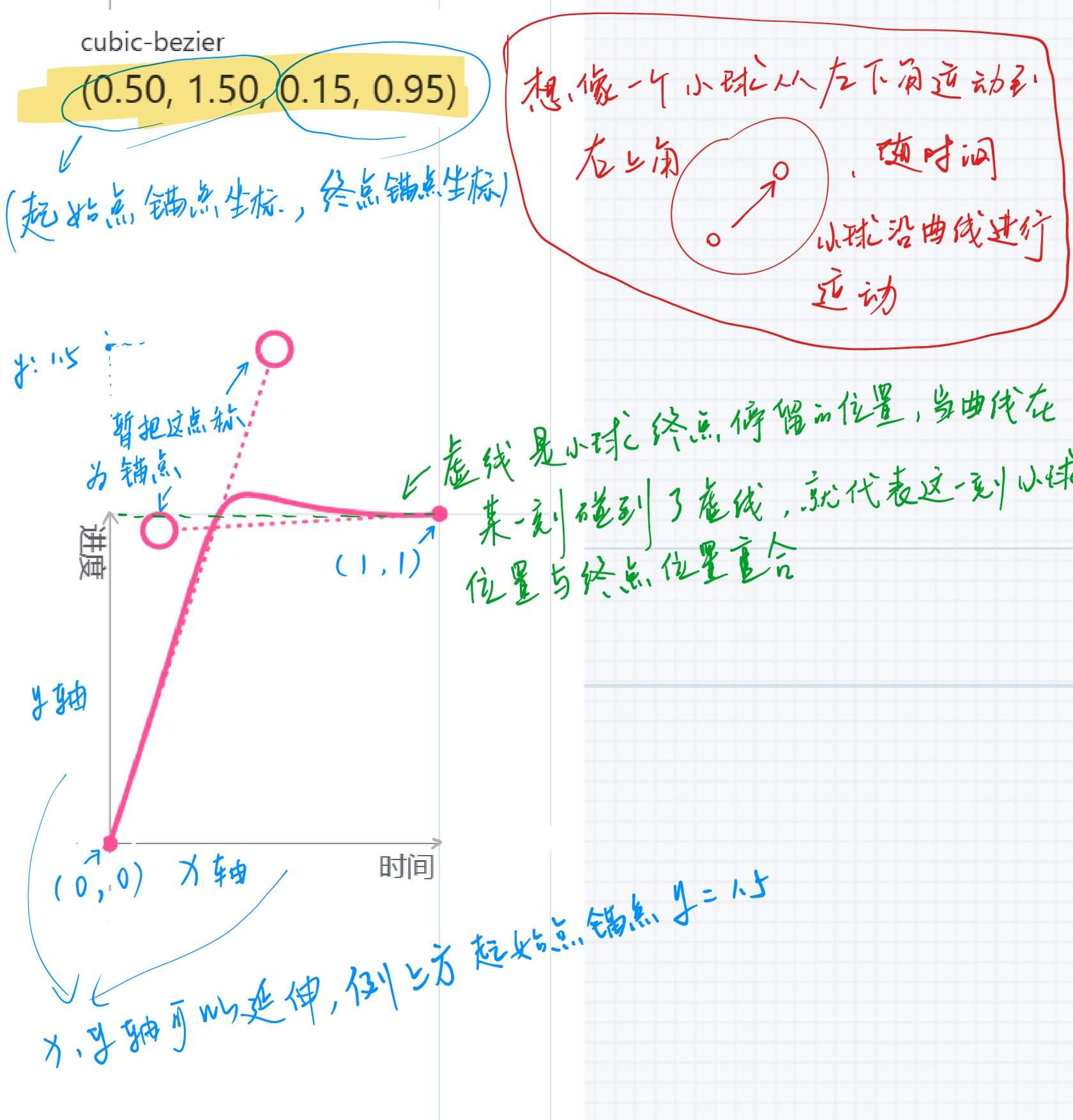
animateTo() : 显示动画
提供全局
animateTo显式动画接口来指定由于导致的状态变化插入过渡动效。同属性动画,布局类改变宽高的动画,内容都是直接到终点状态,例如文字、Canvas的内容等,如果要内容跟随宽高变化,可以使用renderFit属性配置。TextPicker({ range: $r('app.strarray.xxx_text_picker'), selected: $$this.xxxSelected }) .onTouch((event: TouchEvent) => { let ctx = this.getUIContext() if (event.type === TouchType.Down) { // 手指按下 ctx.animateTo( { duration: 300, curve: Curve.Ease }, () => { // 一些对于`TextPicker`组件的属性修改:例如选中的文字变大,添加分割线 } ) } else if (event.type === TouchType.Up){ // 手指抬起 ctx.animateTo( { duration: 300, curve: Curve.Ease }, () => { // 一些对于`TextPicker`组件的属性修改:例如选中的文字大小回复正常,取消分割线 } ) } })上面说的“一些对于
TextPicker组件的属性修改”意思是,显示动画是对于组件内闭包代码改变之后触发的动画效果,如果修改的是属性动画就可以实现的效果,那么其实就没必要使用显示动画了。
手机触摸屏幕事件,动态修改
.gradientHeight('100%'),height属性等?
transition
组件内转场主要通过transition属性配置转场参数,在组件插入和删除时显示过渡动效,主要用于容器组件中的子组件插入和删除时,提升用户体验。
@State private menus: Array<CustomMenu> = [ { // ... }] ForEach( this.menus, (item: BindSheetTitleCustomBuilderMenu, index: number) => { // 子组件 .onClick(() => { if (item.action != undefined) { item.action() } }) // 子组件根据`this.menus`集合的增加和减少同步新增、删除子节点的时候,就会触发子组件的`transition`效果 .transition(TransitionEffect.OPACITY.animation({duration: 300, delay:0}).combine(TransitionEffect.SLIDE))TransitionEffect.OPACITY是系统的其中一个预设效果,以下是全部系统预设。自定义方式参照下方SLIDE参数描述中的代码书写格式并参考官方文档中对应接口的参数来使用。静态成员名称 参数描述 IDENTITY禁用转场效果。 OPACITY指定透明度由默认值 1改变为0的转场效果。即相当于TransitionEffect.opacity(0)SLIDE相当于 TransitionEffect.asymmetric(TransitionEffect.move(TransitionEdge.START), TransitionEffect.move(TransitionEdge.END))。
从START边滑入,END边滑出。
即在LTR模式下,从左侧滑入,右侧滑出;
在RTL模式下,从右侧滑入,左侧滑出。SLIDE_SWITCH指定出现时从右先缩小再放大侧滑入、消失时从左侧先缩小再放大滑出的转场效果。
自带动画参数,也可覆盖动画参数,自带的动画参数时长600ms,指定动画曲线cubicBezierCurve(0.24, 0.0, 0.50, 1.0),最小缩放比例为0.8。当前有两种方式触发组件的transition:
- 当组件插入或删除时(如if条件改变、ForEach新增删除组件),会递归的触发所有新插入/删除的组件的transition效果。
- 当组件Visibility属性在可见和不可见之间改变时,只触发该组件的transition效果。
提示
说明
TransitionEffect可通过combine函数实现多个转场效果的组合,可以为每个效果分别指定animation参数,且前一效果的animation的参数也可适用于后一效果。例如,TransitionEffect.OPACITY.animation({duration: 1000}).combine(TransitionEffect.translate({x: 100})),则时长为1000ms的动画参数对OPACITY和translate均生效。- 动画参数的生效顺序为:本
TransitionEffect指定的animation参数 -> 前面的TransitionEffect指定的animation参数 -> 触发该组件出现、消失的animateTo中的动画参数。 - 如果未使用
animateTo触发转场动画且TransitionEffect中也无animation参数,则该组件直接出现或者消失。 TransitionEffect中指定的属性值如与默认值相同,则该属性不会产生转场动画。如TransitionEffect.opacity(1).animation({duration:1000}),由于opacity默认值也为1,未产生透明度动画,该组件直接出现或者消失。- 更详细的关于
scale、rotate效果的介绍可参考图形变换。 - 如果在动画范围(animateTo、animation)内触发组件的上下树或可见性(Visibility)改变,而根组件没有配置
transition,会给该组件加上默认透明度转场,即TransitionEffect.OPACITY,动画参数跟随所处动画环境的参数。如不需要可通过主动配置TransitionEffect.IDENTITY来禁用,使该组件直接出现或消失。 - 当通过删除整棵子树的方式触发消失转场,如需看到完整的消失转场过程,需要保证被删除子树的根组件的有充足的消失转场时间,见示例3。
Scroll()背景
/* 滚动条 */
private scroller: Scroller = new Scroller()

build() {

    Stack({ alignContent: Alignment.Center }) {
      // 滚动条背景 START
      Column() {
          Text('向上生长').id('bannerText')
          Blank()
          Text('向下扎根').id('bottomText')
      }.width('100%').height('100%')
      // 滚动条背景 END

      Stack() {
      // 滚动条 START
        Scroll(this.scroller){
            Column(){
                Row(){
                    // 内容
                }
                Row(){
                    // 内容
                }
            }.backgroundColor("#ff47887a")
        }
        .edgeEffect(EdgeEffect.Spring)
        .friction(0.6)
        .backgroundColor('#00000000') // 透明才能看到背后的背景
        .scrollBar(BarState.Off)
        .width('100%')
        // 滚动条 END
      }
    }.height('100%')

}
Canvas转图片长按拖出
Image-图片与视频-ArkTS组件-ArkUI(方舟UI框架)
@ohos.data.unifiedDataChannel (标准化数据通路)-ArkTS API-ArkData(方舟数据管理)
新建一个Canvas对象,将背景图片和和弦图的Canvas.toDataUrl数据绘制一起供拖出
const imageUrl = canvas.toDataURL();
// 设置拖拽数据
event.dataTransfer.setData('text/plain', imageUrl);
设备类型判断
多个和弦图Canvas切换
- 老图绕y轴旋转90度,透明度变为0,新图继续绕剩下的90度,透明度变为q1
组件内转场 (transition)-动画-ArkTS组件-ArkUI(方舟UI框架)-应用框架 - 华为HarmonyOS开发者 (huawei.com)
.bindSheet
API:半模态转场
shouldDismiss(包含所有的关闭操作的类型,不可判断) 和onWillDismiss(同上,但可判断类型)都是用来 拦截 半模态窗口 关闭 的方法,按需选择其中一个使用即可。当用户触发关闭操作(下拉关闭/back事件/点击蒙层关闭/关闭按钮)时,只有调用了这两个方法回调中的
dismiss()方法才会关闭半模态。onWillSpringBackWhenDismiss配合上面两个方法用的,如果不需要关闭模态但用户执行了 下拉关闭 操作,调用这个
springBack()之后,就会给一个反弹效果。
Text
可长按、双击选中复制
Text('可长按、双击选中复制')
  .draggable(true)
  .copyOption(CopyOptions.LocalDevice)
TextInput
- 不要用
key,用id - 调用方法
focusControl.requestFocus('id') - 页面首次打开时:
TextInput().defaultFocus(true)
- 不要用
TextInput组件获取焦点时,如何实现点击空白区域收起软键盘效果
controller: TextInputController = new TextInputController();
this.controller.stopEditing();
// 当页面只有多个TextInput组件时,如果使用方案一调用stopEditing方法关闭键盘时需要定义多个controller控制器比较繁琐,这种情况下使用@ohos.inputMethod(输入法框架),通过输入法服务InputMethodController的stopInputSession接口控制点击组件外区域收起键盘。 import { inputMethod } from '@kit.IMEKit'; inputMethod.getController().stopInputSession();
导航与路由
Router
Router切换Navigation-华为HarmonyOS开发者 (huawei.com)
Navigation
动态路由
以上是通过 静态依赖 的形式完成了跨包的路由,在大型的项目中一般跨模块的开发需要解耦(不需要相互依赖),那就需要依赖动态路由的能力。
这里下方借用一下下方官方示例 DynamicRouter 中的FAQ来解释。
注
FAQ
Q:动态路由用起来比较麻烦,为什么不直接使用系统提供的页面路由,而是要重写一套路由栈管理?
A:系统层面现在提供了两种方式进行页面跳转,分别是页面路由 (@ohos.router)和组件导航 (Navigation)。这两种方式用起来都比较简单,但是Router相较于Navigation缺少很多能力(具体可参考Router和Navigation能力对标),所以目前应用开发中推荐使用Navigation进行页面跳转。
而使用Navigation时存在一个问题,需要将跳转的子页面组件通过import的方式引入,即不论子页面是否被跳转,都会使子页面引用的部分组件被初始化。例如页面A使用Navigation跳转到页面B,页面B中有用到Web组件加载一个H5页面。那么当进入页面A时,就会初始化Web组件相关的so库。即使用户只是在页面A停留,并没有进入页面B,也会在进入页面A时多出一部分初始化so库的时间和内存。这是因为在页面A中会直接import页面B的自定义组件,导致so库提前初始化。这样就会导致主页面启动耗时延长,以及不必要的内存消耗。
由于动态路由使用了动态import实现,可以很好的避免这种情况的发生。只有在进入子页面时,才会去初始化子页面的相关组件,减少主页面的启动时间和内存占用,提升性能。而且由于使用了自定义路由栈,可以定制业务上的需求,更好的进行管理。
当主页面中需要跳转的子页面较少时,使用Navigation更加方便。反之,则更推荐使用动态路由进行跳转。
示例项目(涉及跨包路由)
- 运用了
WrapperBuilder的自定义函数打包能力,以及动态路由的跨模块文件引用的能力,解除了har包和hap包的依赖关系,实现了 即使hap包不引用har包,依然能跳转到har包中的页面的能力。目前还不支持动态import变量表达式和跨模块相对路径的文件,所以代码中使用switch作为替代,若后续版本支持,会出相应的补丁。由于环境的差异,不建议下载后直接编译,应先当创建项目,参考示例代码进行编写。 - 我自己拉下来可以直接运行的 API12 仓库:DynamicRouter
- 运用了
(推荐)SystemRouterMap: 运用系统路由表的方式,跳转到模块(HSP/HAR)的页面,可以不用配置不同跳转模块间的依赖。 (gitee.com)
- 其中有三个坑,详见
坑-> 路由 - 我自己拉下来可以直接运行的 API12 仓库:SystemRouterMap
- 其中有三个坑,详见
提示
Router(已过时)
警告
Router路由的页面是一个 @Entry 修饰的Component,每一个页面都需要在 main_page.json 中声明。
Router通过 @ohos.router 模块提供的方法来操作页面,使用前需要先import。
Router作为全局通用模块,可以在任意页面中调用。
Navigation(推荐)
重要
基于 Navigation 的路由页面分为 导航页 和 子页 ,导航页又叫 Navbar ,是Navigation包含的子组件,子页是NavDestination包含的子组件。
每个子页也需要配置到系统配置文件 route_map.json 中(参考系统路由表)。
Navigation通过页面栈对象 NavPathStack 提供的方法来操作页面,需要创建一个栈对象并传入Navigation中。
NV子页面需要拿到页面栈有4种方式:
通过
@Provide和@Consume传递给子页面(有耦合,不推荐)。子页面通过
onReady()回调获取。// 子页面.ets NavDestination() { // ... } .title('PageOne') .onReady((context: NavDestinationContext) => { this.pathStack = context.pathStack })通过全局的AppStorage接口设置获取。
// 父页面全局设置一个NavPathStack aboutToAppear(): void { AppStorage.setOrCreate("pathStack", this.pathStack) } // 子页面中获取全局的NavPathStack pathStack: NavPathStack = AppStorage.get("pathStack") as NavPathStack通过自定义组件查询接口获取,参考queryNavigationInfo。
// 子页面.ets
pathStack: NavPathStack = new NavPathStack()

aboutToAppear() {
  // query navigation info
  let navigationInfo: uiObserver.NavigationInfo | undefined = this.queryNavigationInfo();
  console.info('get navigationInfo: ' + JSON.stringify(navigationInfo));
  if (navigationInfo !== undefined) {
    this.pathStack = navigationInfo.pathStack;
  }
}
跨包路由
Router可以通过命名路由的方式实现跨包跳转。
路由表
提示
路由表不支持在预览器中使用,路由之后页面空白。
父页面
@Entry
@Component
struct NavigationExample {
  pageInfos: NavPathStack = new NavPathStack();

  build() {
    Navigation(this.pageInfos) {
      Column() {
        Button('进入pageOne')
          .onClick(() => {
          this.pageInfos.pushPathByName('pageOne', null);
        })
      }
    }
    .title('父页面')
  }
}
子页面
@Builder
export function PageOneBuilder(name: string, param: Object) {
  PageOne()
}


@Component
export struct PageOne {
  pageInfos: NavPathStack = new NavPathStack();

  build() {
    NavDestination() {
      Column({ space: COLUMN_SPACE }) {
        Button('返回')
          .onClick(() => {
          this.pageInfos.pop()
        })
      }
    }
    .title('entry-pageOne')
    .onReady((context: NavDestinationContext) => {
      // 很重要
      this.pageInfos = context.pathStack;
      hilog.info(DOMAIN, TAG, `current page config info is ${JSON.stringify(context.getConfigInRouteMap())}`)
    })
  }
}
创建路由文件json:entry\src\main\resources\base\profile\router_map.json
{
  "routerMap": [
    {
      "name": "pageOne",
      "pageSourceFile": "src/main/ets/pages/EntryPageOne.ets",
      "buildFunction": "PageOneBuilder",
      "data": {
        "description": "this is pageOne"
      }
    },
    {
      "name": "pageTwo",
      "pageSourceFile": "src/main/ets/pages/EntryPageTwo.ets",
      "buildFunction": "PageTwoBuilder",
      "data": {
        "description": "this is pageTwo"
      }
    }
  ]
}
模块级 module.json5
{
  "module": {
    "routerMap": "$profile:router_map"
  }
}
HdsNavigation
文档:HdsNavigation-UI Design Kit(UI设计套件)
提示
由于需要手动避让系统区域,可能需要:Navigation-标题栏高度枚举说明
stateStyles
组件多态样式
状态名称 类型 必填 描述 normal () => void 否 组件正常(无)状态的样式 pressed () => void 否 组件按下状态的样式 disabled () => void 否 组件禁用状态的样式 focused () => void 否 组件获焦状态的样式 clicked () => void 否 组件点击状态的样式 selected10+ () => void 否 组件选中状态的样式 使用示例
Button('Button1')
	.stateStyles({
		clicked: {
			.backgroundColor('#ffffeef0')
		}
	})
@Styles
- 当前
@Styles仅支持 通用属性 和 通用事件 。 @Styles可以定义在组件内或全局,在全局定义时需在方法名前面添加function关键字,组件内定义时则不需要添加function关键字。请参考用例 组件内styles和全局styles的用法 。- 组件内
@Styles的优先级高于全局@Styles。框架优先找当前组件内的@Styles,如果找不到,则会全局查找。
// 定义在全局的@Styles封装的样式
@Styles
function globalFancy1() {
  .width(150)
  .height(100)
  .backgroundColor(Color.Pink)
}

@Entry
@Component
struct GlobalFancy {
  @State heightValue: number = 100;

  // 定义在组件内的@Styles封装的样式
  @Styles
  fancy() {
    .width(200)
    .height(this.heightValue)
    .backgroundColor(Color.Gray)
  }

  // build(){ ... }
}
@Extend
和 @Styles 不同,@Extend 支持封装指定组件的私有属性、私有事件和自身定义的全局方法。
// @Extend(Text)可以支持Text的私有属性fontColor
@Extend(Text)
function fancy() {
  .fontColor(Color.Red)
}

// superFancyText可以调用预定义的fancy
@Extend(Text)
function superFancyText(size: number) {
  .fontSize(size)
  .fancy()
}
组件模糊
通过组件的通用属性
backdropBlur,blur,backgroundBlurStyle,foregroundBlurStyle来设置组件的模糊效果。组件模糊如果看起来不生效的话,先确认是不是模糊半径设置的太小而背景颜色设置的太实
// 如果设置了20就会看起来没有什么变化
.backdropBlur(100)
.backgroundColor('#33ffffff')
Tabs组件可以使用.barOverlap(true)
@CustomDialog
建议在 @CustomDialog 里面设置背景色:
@CustomDialog
export struct CustomLoadingDialog {
	build(){
		Column(){
      // 自定义弹框内容...
    }
    // 建议
    .background($r('app.color.background_dialog'))
	}
}
而不是在 CustomDialogController 的 backgroundColor 参数里面设置:
private loadingCustomDialogController: CustomDialogController | null= new CustomDialogController({
  // openAnimation、closeAnimation、builder、cancel...等参数

  // 不建议
  backgroundColor: $r('app.color.list_item_background'),
  // 文档说`backgroundColor`是非透明色就加上这句,但是加上这句会导致切换深色模式之后`Dialog`的背景颜色不会改变,如果不加切换深色模式之后弹框过程中和弹框之后,背景颜色会很奇怪
  backgroundBlurStyle: BlurStyle.NONE
动态属性
示例代码和下方 API兼容性 知识点一起
| 能力 | @Styles | @Extend | AttributeModifier |
|---|---|---|---|
| 跨文件导出 | 不支持 | 不支持 | 支持 |
| 通用属性设置 | 支持 | 支持 | 支持 |
| 通用事件设置 | 支持 | 支持 | 部分支持 |
| 组件特有属性设置 | 不支持 | 支持 | 部分支持 |
| 组件特有事件设置 | 不支持 | 支持 | 部分支持 |
| 参数传递 | 不支持 | 支持 | 支持 |
| 多态样式 | 支持 | 不支持 | 支持 |
| 业务逻辑 | 不支持 | 不支持 | 支持 |
API 兼容性
简单一点的:
import { deviceInfo } from '@kit.BasicServicesKit';

build() {
  if (deviceInfo.sdkApiVersion >= 20) {
    Text('API20(包括)以上')
      .contentTransition(ContentTransition)
  } else {
    Text('API20 以下')
  }
}
优雅一点的:
import { deviceInfo } from '@kit.BasicServicesKit'; export class MyModifier implements AttributeModifier<TextAttribute> { applyNormalAttribute(instance: TextAttribute): void { // 根据deviceInfo的api版本信息进行判断 if (deviceInfo.sdkApiVersion >= 20) { instance.contentTransition(ContentTransition) } } }import { MyModifier } from '../common/CommonAttributeModifier'; @Entry @Component struct Index { adaptModifier: MyModifier = new MyModifier(); build() { Column() { Text('具有动态属性的文本组件') // 动态属性 .attributeModifier(this.adaptModifier) } } }
沉浸式
指南:开发应用沉浸式效果
最佳实践:实现沉浸式效果方案对比
下拉刷新
如何通过Refresh组件实现下拉刷新动画-行业常见问题-新闻阅读类行业实践-场景化知识 - 华为HarmonyOS开发者
--------
坑💣
@Watch 和 @State
@State @Watch('configListChanged') private configList: Array<ConfigData> = [ { configId: 'SS-Youtube速度快', isNewConfig: false, }, ]- 如果是对象集合,改变了某一
item中的属性值,不会触发@Watch事件但是会触发@State驱动UI更新,可能和TS一样,只要内存地址没变,就不算对象改变事件。 - 如果是对象,更改属性值会触发
@Watch回调。 - 应该可以理解为是之监听最外层的变化,也就是是对象,对象属性发生变化会回调,是集合,数组本身发生变化(length等)会回调,但是集合内的对象或属性发生变化不会回调。类似
vue中Watch的deep: false
- 如果是对象集合,改变了某一
和
@Link共用的触发时机注意事项@Link的状态更新是同步的,状态变化会立刻触发@Watch回调。而@ObjectLink的更新依赖于父组件的同步,当父组件刷新并将更新后的变量传递给子组件时,@Watch回调才会触发,因此``@ObjectLink触发顺序略晚于@Link`。
Radio组onChange触发多次
- 论坛上发的贴子中有问题代码:元服务Radio单选框组onChange回调触发多次
在 Radio 组的中其中一个 Radio 的 onChange() 里调用下面方法之后
this.getUIContext().getHostContext()?.getApplicationContext().setColorMode(ConfigurationConstant.ColorMode.COLOR_MODE_LIGHT);
会导致页面UI刷新,如果 Radio().checked() 是写死的属性值,就会导致UI刷新之后再次以此默认值渲染 Radio 的选中态,然后再次触发这个 Radio 的 onChange() 事件。
this和$
this和$什么区别-华为开发者问答专区 | 华为开发者联盟 (huawei.com)
Column()和Scroll()
Scroll()里面有Column()的时候,Column()里内容过长时,两个组件的height都不要设置成'100%',这样会导致屏幕不可滚动
List()
外部有组件且设置了padding的话,滚动条会出现在padding的里面,很难看
当
ListItem的style属性设置为ListItemStyle.CARD之后 stateStyles 会在按下之后的x00ms内不生效(具体时间未知),因为CARD手指刚按下的一段时间内是默认的灰色,不可覆盖。可以用长按ListItem触发bindContextMenu(属性:preview: MenuPreviewMode.IMAGE,) 事件复现。
TabTitleBar
元服务使用TabTitleBar组件时,实际渲染高度超出了屏幕一个系统导航条高度
华为开发者论坛帖子:https://developer.huawei.com/consumer/cn/forum/topic/0204166813193049917
华为开发者工单:https://developer.huawei.com/consumer/cn/support/feedback/#/ticketDetail?id=409843 工单里有最小化代码的demo
现在解决办法是给TabTitleBar组件加一个margin({bottom: 下面api中获取到的导航条高度})
@ohos.window (窗口)-图形图像-ArkTS API-ArkUI
Blank().layoutWeight(1)
Blank()只能在Column、Row()、Flex()时填充父组件空余的主轴空间,如果父组件没有设置height或者width则无效果
加上layoutWeight属性之后,layoutWeight是自适应占满剩余空间
.bindSheet
- 如果发现
backgroundColor不生效,可能是背景颜色和父级颜色差不不大,加上blurStyle的模糊效果导致的,可以换个blurStyle类型试试... - 如果
bindSheet里的用了navigation里套了List,那List的.edgeEffect()在属性就失效了 ,同时也会导致bindSheet的detents属性里的SheetSize.FIT_CONTENT值就不生效了,这两个的原因应该都是因为Navigation把所有空间都撑满了。- 如果
bindSheet里套了NV,建议隐藏掉NV的标题栏hideTitleBar(true),若使用
- 如果
Prompt
如果发现在 Builder 里使用 prompt.showtoast 不弹框,是因为当前使用处存在UI上下文不明确问题,可以通过使用 UIContext 中的 getPromptAction 方法获取当前UI上下文关联的 PromptAction 对象。
关联链接:工单417000 - 华为开发者联盟
private promptAction:PromptAction = this.getUIContext()?.getPromptAction()
对象里的属性值
/* BindSheetTitleCustomBuilder 组件内菜单 */
export interface BindSheetTitleCustomBuilderMenu{
  // value: string
  // Symbol符号
  symbol?: Resource
  symbolFontColor?: Array<ResourceColor>
  // 背景颜色
  symbolBackgroundColor?: ResourceColor
  // 是否启用(现在没有效果)
  isEnabled?: boolean
  // 点击事件
  action?: Function
}
/* 主题色 */
@Consume('icon_emphasize')
icon_emphasize: ResourceColor

private saveMenus: BindSheetTitleCustomBuilderMenu = {
  symbol: $r('sys.symbol.save'),
  symbolFontColor: ['#e6ffffff'],
  // 跟随主题色:由于在这里直接赋值 this.icon_emphasize 编译器提示需要初始化 this.icon_emphasize 的值,放到了 aboutToAppear 回调里重新赋值
  symbolBackgroundColor: '#FF0A59F7',
  action: () => {
    this.saveConfig(this.configData.isNewConfig)
  }
}
animation()
Column() {
  Row() {
    // 按钮和标题
  }
}
// Column是由Row的内容撑起来的,这里直接设置Column的背景为白色,并用visibility & animation()在显示和隐藏时增加动画,可以看效果,是默认由左上展开和缩小的。(应该可以利用animateTo来处理。还有可以看下面的处理方法)
.backgroundColor(Color.White)
.visibility(this.isShow ? Visibility.Visible : Visibility.None)
.animation({
  duration: CommonConstants.STATUS_HEAD_ANIMATION_DURATION,
  curve: Curve.Smooth,
})
可以将需要增加动画的地方放到Column里面的一层
Column() {
  Row() {
    // 按钮和标题
  }
  // 将背景颜色放到`Column`里面的`Row`组件上面
	.backgroundColor(Color.White)
}
.visibility(this.isShow ? Visibility.Visible : Visibility.None)
.animation({
  duration: CommonConstants.STATUS_HEAD_ANIMATION_DURATION,
  curve: Curve.Smooth,
})
子组件回调方法
注意:不要将父组件内方法的引用直接传给子组件,而是利用回调的方式直接执行
子组件
@Component
export struct ChildComponent {
  @Prop
  text: string
  // 回调方法
  // 如果父组件需要子组件在回调中传入固定格式的参数,action类型可以改为`(recordId: string) => void`等类型
  action?: Function

  build() {
    // 执行回调方法
    if(undefined != action){
      this.action()
    }
  }
父组件中使用
build(){
  ChildComponent({
    /**
     * text: this.text,
     * action: this.playRecord // 错误:直接传引用,代表方法在实际调用处执行,若方法内有this,则this指向的是子组件的环境,而非定义处(父组件的环境)
     */
    text: this.text,
    action: () => {
      // 利用定义回调的方式来处理:子组件触发调用父组件内方法
      this.playRecord(item.id) // 正确
    }
  })

  playRecord(recordId: string): void {
    /**
     * 如果直接传给了子组件该方法的引用(this.playRecord 而不是 () => { this.playRecord(id) })
     * 则程序会崩溃,因为传了方法引用过去,方法的实际执行是在子组件内,而不是方法定义的环境内,这样this指向的就
     * 是子组件的环境,导致找不到prompt属性而运行时崩溃ERROR。
     */
    this.prompt.showToast({ message: `播放id[${recordId}]的录音` })
  }
}
子组件样式
@Component
struct ChildComponent {
  build() {
    Button(`Hello World`)
  }
}

@Entry
@Component
struct MyComponent {
  build() {
    Row() {
      ChildComponent()
        .width(200)
        .height(300)
        .backgroundColor(Color.Red)
    }
  }
}
说明:
ArkUI给自定义组件设置样式时,相当于给ChildComponent套了一个,这些样式是设置在容器组件上,而非直接设置给ChildComponent的Button组件。渲染结果显示,背景颜色红色并没有直接设置到Button上,而是设置在Button所在的不可见容器组件上。
组件复用 @Reusable
// `recordIDataSource`是实现了IDataSource接口的类型
LazyForEach(this.recordIDataSource, (item: RecordInfo, index: number) => {
    ListItem() {
      RecordListItemComponent({
        recordInfo: item,
        index,
        // action: this.playRecord // 错误方法,不能只传方法引用过去,这样playRecord方法里的this就指向了调用处
        action: (obj: RecordInfo) => {
          // FIXME 由于组件复用,在数据源[0]处新增一个item之后点击新增的item,action箭头函数内打印的是由于新增了一个[0]而刚刚销毁了的复用组件的item数据,但是不知道为什么action箭头函数里面的参数不是跟随数据源改变的。
          // this.playRecord(item.id, item.path)
          this.playRecord(obj)
        }
      })
      })
    }
  },
  // ForEach、LazyForEach刷新原理:修改状态变量数据源时,要ForEach或LazyForEach会捕捉到key的变化,从而通过重建组件节点来刷新
  // (item: RecordInfo, index: number) => `audio_item_${index}_${item.name}`
  (item: RecordInfo, index: number) => `audio_item_${index}_${item.name}_${item.isPlaying}`
)
坑:子回调父方法:这里 recordInfo 和 index 是直接从 LazyForEach 组件属性内获取的,如果此时在 数据源[0] 处新增了元素,此时子组件内获取到的 recordInfo 和 index 会在复用组件内刷新,但是 action 组件内的数据不会被覆盖,不知道原因(已注释),似乎 action 里的代码已经被编译好了似的。现在用的方法是从子组件吧 recordInfo 通过回调方法再给传出来。
参考开发者论坛自己的帖子:LazyForEach 和 Reusable 在数据源index:0处依次新增多个元素的问题-华为开发者问答
forEach
forEach 的设计是同步的,它会遍历数组中的每个元素,并立即调用回调函数。如果回调函数是 async 的,forEach 会将其视为一个普通的函数调用,不会等待 await 的完成。因此,forEach 会继续执行下一个回调,而不会等待前一个回调中的异步操作完成。
示例代码
const array = [1, 2, 3];

array.forEach(async (item) => {
  await new Promise(resolve => setTimeout(resolve, 1000)); // 模拟异步操作
  console.log(item);
});

console.log("forEach finished");
输出结果:
forEach finished
1
2
3
合用 bindSheet 问题
问题现象
bindSheet 和 foreach 合用的问题,$$this.isShow 会弹出两次半模态,如果是 this.isShow ,则半模态弹出的次数是数组的长度数,如何在某一个 foreach 中的 item 点击的时候只弹出一个弹窗。
解决措施
给每一个弹窗都绑定一个 @State 修饰的变量。
参考代码如下:
@Entry
@Component
export struct BindSheetAndForEach {
  // 不用这个
  @State isShow: boolean = false;
  @State arr: number[] = [1, 2, 3, 4];
  // 用这个
  @State isHoverText: Array<boolean> = new Array<boolean>(this.arr.length).fill(false);

  @Builder
  myBuilder() {
    Column() {
      Button('content1')
    }
  }

  build() {
    Column() {
      ForEach(this.arr, (item: number, idx: number) => {
        Row() {
          Text('item')
          Button('弹框')
            .onClick(() => {
              this.isHoverText[idx] = true;
            })
            .bindSheet(this.isHoverText[idx], this.myBuilder(), {
              backgroundColor: Color.Gray,
              height: SheetSize.MEDIUM,
              showClose: true,
              onDisappear: () => {
                this.isHoverText[idx] = false;
              }
            })
          Checkbox()
        }
        .border({ width: 1, radius: 5 })
      })
    }
  }
}
提示
不过不推荐这样绑定半模态,可以给父元素(或其他元素)绑定半模态,然后通过 传参 的方式显示不同内容。
触摸热区范围
通过自定义的方式获取 responseRegion 属性值,参考代码如下:
@Entry
@Component
struct TouchTargetExample {
  @State text: string = '';
  @State x: number = 0;
  @State y: number = 0;
  @State reg_width: string = '50%';
  @State reg_height: string = '100%';

  build() {
    Column({ space: 20 }) {
      Text(`{x:0,y:0,width:'50%',height:'100%'}`)
      // 热区宽度为按钮的一半,点击右侧无响应
      Button('button1')
        .responseRegion({
          x: this.x,
          y: this.y,
          width: this.reg_width,
          height: this.reg_height
        })
        .onClick(() => {
          this.text = 'button1 clicked';
          console.info('button1 clicked: ' + this.x + ' ' + this.y + ' ' + this.reg_width + ' ' + this.reg_height);
        })

      Text(this.text)
        .margin({ top: 10 })
    }
    .width('100%')
    .margin({ top: 100 })
  }
}
参考链接
双指手势识别忽略单击手势
使用组合手势 GestureGroup 的互斥识别模式。双击事件需放在单击事件前面,互斥识别是按排列顺序来识别,如果单击事件放前面则只会识别到单击事件。参考代码如下:
@Entry
@Component
struct TapGestureExample {
  build() {
    Column() {
      Text('Click twice')
        .fontSize(28)
        .gesture(GestureGroup(GestureMode.Exclusive,
          TapGesture({ count: 2 })
            .onAction(() => {
              console.info('TapGesture 2');
            }),
          TapGesture({ count: 1 })
            .onAction(() => {
              console.info('TapGesture 1');
            })
        )
      )
    }
    .width('100%')
    .height('100%')
    .justifyContent(FlexAlign.Center)
    .alignSelf(ItemAlign.Center)
  }
}
如何将内容直接复制到剪贴板
import { pasteboard } from '@kit.BasicServicesKit';
import { promptAction } from '@kit.ArkUI';

@Entry
@Component
struct CopyText {
  private textContent: string = '复制我';

  build() {
    Column() {
      Text(this.textContent)
        .onClick(() => copyText(this.textContent))
    }
  }
}

function copyText(text: string) {
  const pasteboardData = pasteboard.createData(pasteboard.MIMETYPE_TEXT_PLAIN, text);
  const systemPasteboard = pasteboard.getSystemPasteboard();
  systemPasteboard.setData(pasteboardData); // 将数据放入剪切板
  systemPasteboard.getData().then((data) => {
    if (data) {
      promptAction.showToast({ message: '复制成功' });
    } else {
      promptAction.showToast({ message: '复制失败' });
    }
  })
}
共享元素转场
两个页面中的元素设置了同样的 .geometryTransition('id') 之后,好像还需要将页面路由的操作,放到 animateTo 动画闭包中,配置对应的动画参数以及关闭系统默认的转场。
@Builder
@Builder装饰的函数内部,不允许修改参数值,否则框架会抛出运行时错误。开发者可以在调用@Builder的自定义组件里改变其参数。请参考 在@Builder装饰的函数内部修改入参内容 。@Builder通过按引用传递的方式传入参数,才会触发动态渲染UI,并且参数只能是一个。请参考 按引用传递参数 。@Builder如果传入的参数是两个或两个以上,不会触发动态渲染UI。请参考 @Builder存在两个或者两个以上参数 。@Builder传入的参数中同时包含按值传递和按引用传递两种方式,不会触发动态渲染UI。请参考 @Builder存在两个或者两个以上参数 。@Builder的参数必须按照对象字面量的形式,把所需要的属性一一传入,才会触发动态渲染UI。请参考 @Builder存在两个或者两个以上参数 。
路由
路由混用注意点:
- router和Navigation混用NV跳转失败问题 ,注意以下三点:
index中未使用Navigation组件module.json5中routerMap字段配置或resources/base/profile/route_map.json文件内存在问题entry模块中oh-package.json5的dependencies未配置